Stock Picks For NovemberWhile the bulk of my portfolio and separately managed accounts business predominantly involve investments in volatility products (explained here), my observation as a service provider is that investors, whether consciously or unconsciously, often lean toward stocks. This burgeoning interest led me to step into this realm since November 2022. My chosen approach aligns with value investing principles, drawing inspiration from the philosophies of renowned investors like Howard Marks and Benjamin Graham. My primary nemesis in this pursuit is subjectivity. Hence, I've developed a sophisticated algorithm that evaluates over 2,400 publicly traded American companies through a discounted cash flow analysis. This model leans heavily on sensitivity analyses concerning major assumptions (such as discount rate, beta, and earnings extrapolation). Its purpose is to ensure that, at the very least, a company's value substantially exceeds its current market price. I typically reassess my recommended stock portfolio on a monthly basis, allocating around 2.5% to 5% per company. Once a company's stock price meets its estimated fair value, I close the position. Figure 1 illustrates the probability density function showcasing the relative value of the US companies I've scrutinized. It's evident that most of these companies appear to be undervalued by 5% to 10%. 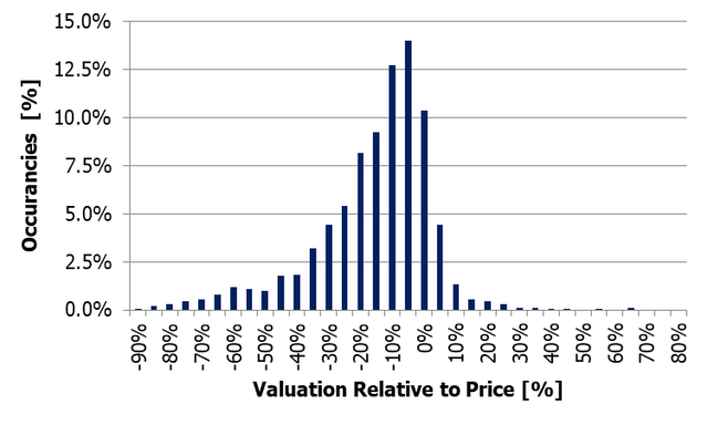 Figure 1: Probability density functions displaying valuation of US companies. At the time of writing, year-to-date (YtD) returns for the S&P 500 stand at approximately 19%. Interestingly, this seems somewhat contradictory when compared to Figure 1. A deeper analysis reveals that the 2023 market equity performance has been primarily driven by the top 10% of stocks. In contrast, the remaining 90% of stocks are nearly flat; refer to Figure 2. 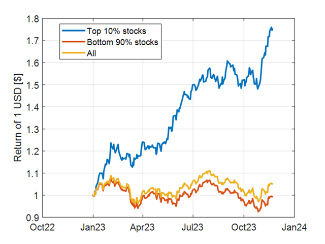 Figure 2: Performance comparison between the top 10% and bottom 90% of companies in the S&P 500. The analysis assumes equal weighting. This article shares the stock picks for the month of November. Following the valuation of companies, the screening process involves assuming:
Table 1: November's Stock Picks. 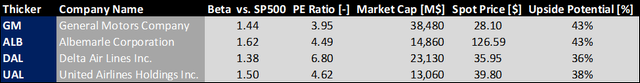 General Motors GM, Albermarle ALB, Delta Air Lines DAL and United Airlines UAL have an average upside potential of 40%. A pertinent question one might ask is: does this method yield results? Is it successful? To monitor the performance of my recommendations accurately, I've established a live portfolio on a well-known copy-trading website. This setup ensures transparency regarding my methodology and the potential claims I might make about the performance of my picks. Figure 3 displays the results. I usually prefer using the Dow Jones as a benchmark because the stocks in this index better mirror my approach in selecting equities for the portfolio. 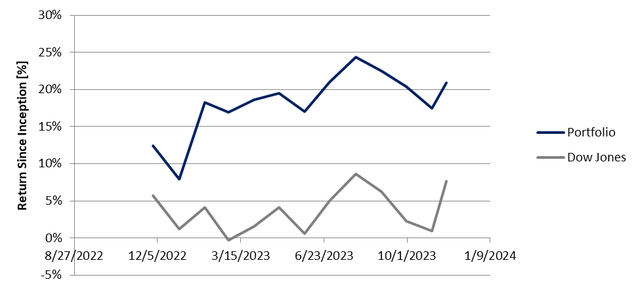 Figure 3: Performance comparison of the stock picking strategy outlined in this article against the Dow Jones benchmark.
2022 was a very painful year in my investment career, nearly nothing seemed to work. I used to rely a lot in rotating positions in between asset classes that were typically uncorrelated but… not 2022. Nearly everything was correlated and moving south. I take investment decisions based on different volatility parameters like the VIX roll yield and VIX measured at different time frames but… 2022 was special: nothing flashing red while the equity market slowly and painfully moving down. In the middle of the year, I asked myself:
It took me a few months, lot of Excel and a tip from a market veteran to get into a Eureka moment. This friend of mine said: 2022 reminded him of the Dotcom bubble. At that time the market was trending down but, at a certain extent, there was neither panic nor noise, just a painful bleeding. He was right. If we assume that panic and noise translate into VIX spikes, in Figure 1, it can be observed that despite a 20-30% drawdown, the VIX was elevated but never shoot significantly higher than 30% during the Dotcom bubble. This was very different from what many of us have experienced after the 2007-2009 financial crisis. We got into the mental picture of: there is a lot of drawdown thus the VIX will have to spike. As 2022 showed, this was far from the truth. 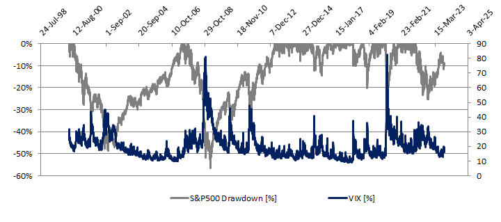 Figure 1: S&P500 drawdown and VIX In essence VIX is a standard deviation. A value of 15% means that within one year from now, the S&P500 could close plus/minus 15% within 68% probability. First keyword is “plus/minus”. We should disconnect the believe that the S&P500 movement is inversely correlated to the one of the VIX. This is correct 85% of the time, meaning that there are 15% of instances in which the two are positive correlated or uncorrelated. From Figure 1, we can make a second observation: the VIX spikes only during uncertainties. An example quite fresh to our memory is March 2020. There are other case like 2018 Q4 and August 2015. This gives an answer to the first question, we should stop assuming a nearly perfect inverse correlation between the VIX and the S&P500. Could this situation have been spotted? I have tried not to overcomplicate my life and I made the hypothesis that somehow this information was hidden in the prices of the main US indexes. What 2000 and 2022 had in common? In both instances, everyone was talking about stock market bubble. Usually overinflated prices are found in growth stocks (typically part of the Nasdaq 100) and less in value stocks (typically part of the Dow Jones). This can be observed in Figure 2, there was a major divergence between the growth of the Nasdaq and Dow in 2000 and 2022. 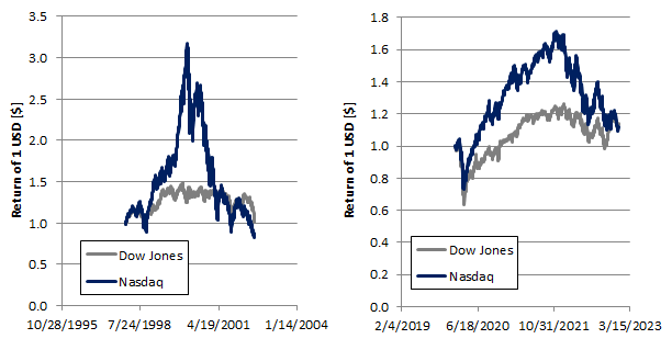 Figure 2: Price evolution of the Dow Jones and Nasdaq 100 during the Dotcom bubble and 2022. But the market is not the economy, even if a bubble exists we do not know when it is going to burst, maybe until now. I will not share the details of my secret sauce, but by looking at the price action of the Nasdaq and the Dow Jones, it is possible to derive an indicator that spots when a bubble might burst. In Figure 3, this “bubble burst” indicator showed high readings during 2000, 2022 and early 2023. 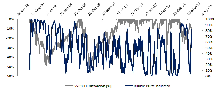 Figure 3: S&P500 drawdown and bubble burst indicator. The simplest way to use it, it is to identify a threshold level beyond which a strategy moves from 100% equities (S&P500 in this example) to cash. I found the sweet spot being 75-80%. Higher reading indicates pain for the equity market. A simple backtest is shown in Figure 4; a threshold value of 80% was used. The lower chart shows a drawdown that is drastically reduced. The reduction in drawdown resulted in 85% higher return (upper chart) just with the use of one single indicator. 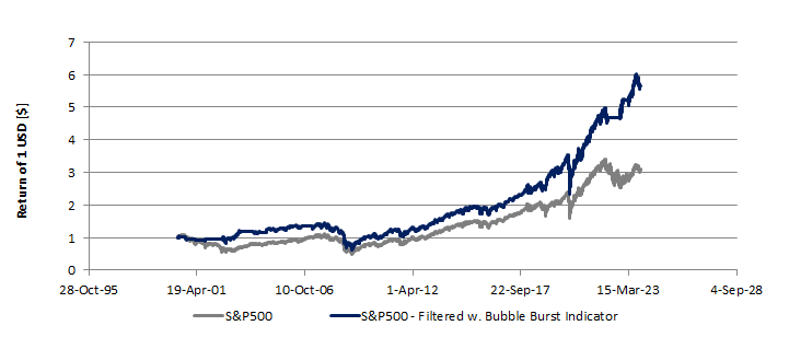 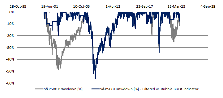 Figure 4: Return (upper chart) and drawdown (lower chart) of the S&P500 buying and holding vs. going to cash above the threshold value of the bubble burst indicator.
We are almost in 2024, why am I writing this article now? History often rhymes and it is not unlikely that we will experience again a stock market bubble burst, better being prepared. Think about 2023: most of the gains in the equity market were driven by the AI mania. AI stocks are just a few, all the others stayed relatively flat throughout the year. At the moment of writing, my bubble burst indicator is well above 80%. Better being prepared and having a plan of what might come! Leveraged Exchange Traded Products (ETPs) need to be resetted on daily basis to deliver a percentage move that is a positive or negative multiple of an underlying security’s percentage price movement. In 2019 Matthew Crouse highlighted a side effect of this rebalancing process: a price drag that is proportional to the leverage factor and volatility of the underlying asset (link to the paper here). Crouse estimated that the resulting drag on the Compounded Annual growth Rate (CAGR) of the leveraged ETPs can be estimated as: L*(L-1)*0.5*sigma^2. L is the leverage factor while sigma is the annualized volatility of the reference security. Figure 1 shows the CAGR drag as function of a hypothetical ETP leverage factor at 15% annualized volatility. From the chart, we can make two observations:
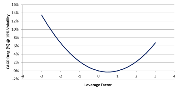 Figure 1: Theoretical CAGR drag as function of a hypothetical ETP leverage factor at 15% volatility. These two observations might result in an opportunity for a potential profit. In the first case, we can think of simultaneously shorting two ETPs having opposite leverage factor while in the second case we can think of selling the underlying asset while buying twice the share of an instrument deleverage by 0.5. How big is this opportunity? Case1: Shorting ETPs with opposite leverage factor Let’s start from a theoretical case study. For this example I have chosen a leverage factor of 3. First, we can find on the market several ETPs being leveraged by plus/minus 3. Second, the higher is the leverage factor the higher is the CAGR drag differential between the positive and the negative leveraged instrument. The opportunity is presented in Figure 2. The opportunity is independent of the CAGR of the underlying asset while it grows with assets having high volatility. 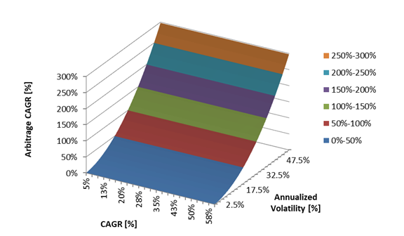 Figure 2: Theoretical CAGR of simultaneously shorting two ETPs with a leveraged factor of +3x and -3x as function of the CAGR and Annualized volatility of the underlying asset. Let’s now move on to a backtest using TQQQ and SQQQ. These two products are the 3x and -3x leveraged versions of QQQ. QQQ is an ETP that replicates the behavior of the Nasdaq 100 index. The results are shown in Figure 3. The CAGR was estimated to be 3.68%, the maximum drawdown 2.63% and the Sharpe ratio 1.35. On a risk adjusted basis, the results are not bad. Since 2009, the Nasdaq 100 had a CAGR of 17%, Sharpe 0.75 and maximum drawdown of 54%. 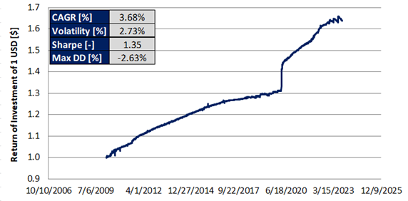 Figure 3: Backtest from simultaneously shorting TQQQ and SQQQ. Case2: Shorting the underlying asset while going long twice on the 0.5x leveraged ETP As in the previous case, let’s start from a theoretical case study. According to the theory, the highest CAGR boost is achieved with a deleverage factor of 0.5. We now use this factor to compute the CAGR as function of the CAGR and annualized volatility of a hypothetical underlying asset. The results are presented in Figure 4. Like in the previous case, the outcome is independent of the CAGR of the underlying ETP while the higher is the volatility the higher the opportunity. 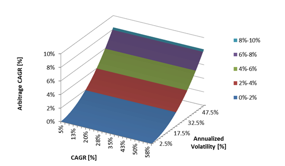 Figure 4: Theoretical CAGR of simultaneously shorting a reference asset while going twice long on its 0.5x leverage version. There are not many deleveraged products on the market to perform a backtest. At the moment of writing SVXY is (with some minor differences) the deleveraged version of SVIX. Unfortunately SVIX is a little bit older than 1 year and as result the backtest might not provide a full picture of what might happen over several different market conditions. The results are presented in Figure 5. With this approach, we get a CAGR of 6.83%, Sharpe ratio of 0.97 and a maximum drawdown of 4.67%. 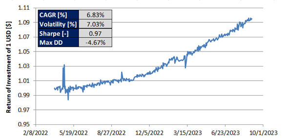 Figure 5: Backtest from shorting the reference asset (SVIX) while going twice long on the deleverage asset (SVXY). It is important to keep in mind that whether Case 1 or Case 2 is implemented, the portfolio need to be rebalanced on daily basis. Failure to rebalance the portfolio to compensate for the ETPs daily price action will result in an outcome very different from what it can be expected. When the market trends upward, performance can be exceptional. When the market trends downward, lot of drawdown can be expected. This is illustrated in Figure 6 using as example TQQQ and SQQQ. Very few if no-one would have the stomach to digest 80% drawdown.  Figure 6: Backtest from simultaneously shorting TQQQ and SQQQ without rebalancing the portfolio on daily basis. Source: author.
In conclusion, the CAGR drag resulting from the rebalance of leveraged ETPs might create a couple of arbitrage opportunities. The CAGR of these two opportunities increase with assets that are volatile. In this article we have evaluated two case studies and their profit potential. It is important to keep in mind that very rarely we have free lunches and there are risks associated with the strategies described in this article. First when shorting an asset, we are not in control of it. Our short position can be called anytime while we might keep holding the other side of the trade. Second, there might be occasions when we are not allowed to close one of both side of the trade. Usually these things happen when things go south. Last, dealing with leveraged ETPs is very risky. Not knowing exactly how these products function might result in major losses. Treasury Bonds & Short VolatilityWhen we think about retirement and growing our retirement saving account, what we want is an investment vehicle that delivers steady returns with a drawdown as small as possible. Traditionally we are advised to invest in a combination of stocks and bonds. As these two assets classes are inversely correlated, it is common belief that they offer downside protection during rainy days for the equity market. Is it really the case? The Vanguard Balanced Index Fund, ticker VBINX, that invests 60% in bonds and 40% in equities says otherwise. The chart below shows that such portfolio can experience large drawdowns relative to the annualized return. This is something that we do not really want. First because it is emotionally intensive to handle 35% maximum drawdown (it is not unlikely the portfolio holder might sell low). Second because it will take several years to recover from the drawdown. Let’s not get fooled by the idea of equities diversification. When the equity market goes south, equities and different asset classes become all closely correlated thus offering very little downside protection; read more in here.
We can think of going one step ahead and using the Efficient Frontier Portfolio to best identify what equities and bond ETFs to include in our account. In this case we get into a trade-off between relative portfolio volatility (Sharpe ratio) and annualized returns (CAGR). More on how the numbers in the table below were generated in here. 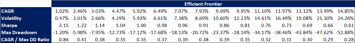 Is there a way out? Can we get steady returns and decent CAGR without day trading? In my opinion yes but we need to rethink the instruments we use. Short dated high quality bonds, should be still a part of the portfolio. If held to maturity, 1 year lock up period is acceptable, can deliver a steady return with virtually no drawdowns; assuming there is no default on payments. Let’s keep in mind that we might have a recency bias. In the last 10-15 years the Treasury Bond yields have been nearly 0% thus many investors have consider them unattractive. If we look at the yields on a larger time horizon, this is not the case. Considering the inflation we are experiencing, the ending of the era of easy money,… it will not be unlikely that in the long run T-bond yields will land in the 3 to 5% territory (1 to 2 percentage points above the inflation rate) thus potentially becoming appealing again to many retirement accounts. 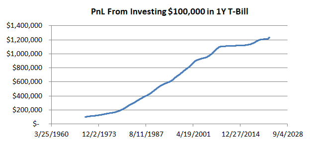 We now need a second component to boost the CAGR without compromising much the volatility and drawdown of the portfolio. Historically this second component has been equities. Equities have large drawdowns relative to their CAGR and if we assume that in the next decade the equity market will not trend upwards as during the 2010s because of a stickier inflation and tighter economic policies, we then need to look elsewhere. In my opinion short volatility products should become the second part of the portfolio. ETPs like SVXY and SVIX derive their value from the front two months VIX futures term structure. The front two months, M1 & M2, naturally decay toward the VIX spot value. This decay and the absolute price movement of the futures are the drivers behind the price variation of SVXY and SVIX. With the few exception of the VIX futures spiking as result of elevated equity market fear, the vast majority of time, they decay towards the VIX spot value. 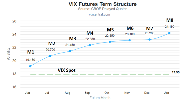 Blindly using this products is not advisable. When M1 and M2 are slightly above or below the VIX spot price, these products nose dive. If we have a very simple rule and we say that we do not use these products when the two VIX futures front months are below the VIX spot value increased by 2.5% then we are better off; see chart. Is it day trading? Not really because we are talking of 2 to 3 trades per month.
The PnL from shorting volatility might look very volatile at first with a high drawdown, but at a second look it is not. Let me explain, if a short vol product experiences a drawdown of 60%, it will take a bit more than 1 year to break even given that the annualized return is ca. 51%. In the case of the traditional 60-40 portfolio, after experiencing a drawdown of 36%, it will take 4.7 years given that the CAGR is 7.63%. Do you still think it is volatile? Let’s now put short term dated bonds and shorting volatility together. For the sake of comparing to VBINX, I have chosen to allocate 14% to the short vol position so that the CAGR of the two approaches is comparable. Despite, I believe that 7.5 to 10% is a more appropriate allocation because of the better CAGR to maximum Drawdown ratio. For the same CAGR as VBINX, the current approach reduces the drawdown by 4.5 times while nearly doubling the Sharpe ratio.
There is a value to consider an alternative to equities to the traditional 60-40 balanced portfolio. According to the way I see it and what the numbers say, this alternative is called shorting volatility. Better drawdown and more consistent returns
I am writing this brief article after having carried out an analysis on whether it is worth to allocate part of the NEXT-alpha portfolio to option trading. I got interested in options because they allow us to mathematically quantify the probability of success of a trade. By knowing how much we can lose (assuming we take a risk defined trade), how much we can win and the success rate of the trade, we can then estimate the long term rate of return of our portfolio. Somewhat like it happens in Las Vegas, the only difference is that this time we can be the casino. The subject is to say the least vast. In this article, I am briefly scratching the surface and apologies if not enough context is provided with some of the terminology used hereafter. I like to keep things simple and reduce the number of the moving parts. Is there an option strategy that fit all the cases? Short answer is: no. Option strategies can be seen as a toolbox: for any situation then there is an optimal strategy. You can find out more on how to match market environment and optimal option strategy in here https://optionalpha.com/library/ultimate-options-strategy-guide and here https://www.vtsoptions.com/trade-types. To minimize the complexity of the problem, I said to myself: if I have no view on the direction of the market, if I want to take a risk defined strategy and if I want to know a priori the success rate of my trade, what strategy should I use? After lot of munching, my conclusion was the Credit Iron Condor. Premium can be collected with the passage of time, the risk is defined when the trade is set up, it has no directional bias and the probability of success is normally set at 70%. Can I use it in any situation? Nope. I need to make sure that the rank of the implied volatility of the underlying asset is elevated enough to make sure that there is premium to collect; i.e. our potential profit. How to set up an Iron Condor trade? You can read more in here: https://optionalpha.com/strategies/iron-condor. In short: a put and a call options with a delta of 15 are sold. While a put and a call options are bought at a strike price slightly lower and higher respectively as compared to the put and call options that have been short sold. Typically the expire date is chosen to be: 30 to 60 days. Selecting the delta at 15 ensures that the probability of success of the trade is ca. 70%. A typical Profit/Loss diagram at expiration for an Iron Condor trade looks like as in Figure 1. Typically the number of contracts is chosen so that the max loss is set at 1 to 2.5% of the portfolio AUM. Quite often for many, this does not look a good trade. This is because when looking at the payoff diagram, the max loss could be 2 to 5 times higher than the max gain. Why to even enter such trade? Figure 1 shows the PnL at expiration. In reality the PnL as function of the strike price evolves over time. In Figure 2, the blue line represents the PnL when the trade opens while the orange line, the PnL at expiration. Over time, the blue line converges towards the orange because of the theta decay. The theta decay is the loss of value of the option per day. Because the strategy sells a put and a call option with a delta of 15, the trade takes advantage of this decay. When trading the Iron Condor, the trade is exited when the sum of the Profit/Loss of the 4 options is equal to plus/minus 50% of the maximum potential profit. As result, for a trader, the max gain is equal (minus fees) to the max loss. 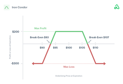 Figure 1: Credit Iron Condor profit and loss at option expiration as function of underlying asset strike price. Source: Option Alpha. 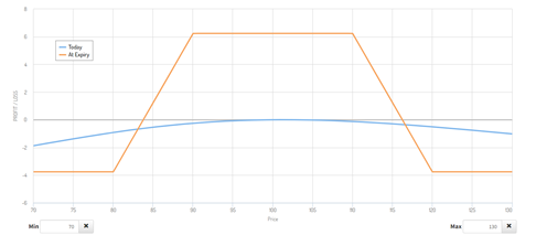 Figure 2: Credit Iron Condor profit and loss at option expiration and opening as function of underlying asset strike price. Source: Option Creator. Moving forward to the item that matter the most: how to compute the long term return of investment and associated risk? The way I did it was to evaluate a multitude of pay-off diagrams for a large number of uncorrelated asset classes. For simplicity in here, I’ll report the calculations I did using the S&P500 options (SPX) expiring on May 20, 2022. The table below shows the contracts that were purchased. 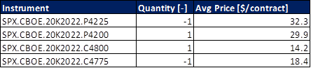 The maximum potential loss was calculated to be $1,590 while the max potential gain $660. A stop loss and a take profit are then set at plus/minus 50% of $660. Assuming $16.8 round trip fees for 4 contracts (yes, the fees are high in Europe), this equates to a max loss of $346.8 and $313.2. Assuming that the trade was opened having in the account an amount equal to the max loss then the max potential gain and loss for this trade is: 19.70 and -21.81% respectively. We now know that the probability of success of the trade is 70%. As result the long term average return of such trade will be in the ballpark of 7.25% (70%*19.70% minus (100%-70%)*21.81%). Say that 24 of such trades are made per year then the long term CAGR would be 173.89%. Good, right? Not so fast. Imagine that the 30% of the loosing trades are realized one after the other, then the portfolio would experience a drawdown of 83% ((1-21.81%)^(24*30%)-1). Something has to be done.
Two actions can be taken:
The first action will reduce the drawdown of the entire portfolio. Allocating 7.5% of the AUM, in the very worst case can lead to a maximum drawdown of the portfolio of 11.78%. The second action will reduce the probability of having several consecutive loosing trades. It is important not to exceed an allocation per trade in the ballpark of 1 to 2%. As result, the number of uncorrelated assets to have at disposal for trading should be at least 5 to 10 thickers. In my watch list I have: US equities, gold, wheat, corn, US T-bonds, crude oil and natural gas. The selection was based on the fact that these assets are uncorrelated or loosely correlated and my familiarity with these (I have been looking at these numbers daily for at least 6 years). Putting the numbers together and incorporating all these actions, we can then expect a long term CAGR of 13.04% in the entire portfolio solely trading Iron Condors while a maximum drawdown of 11.78%. In my opinion this is acceptable and could be implemented in the NEXT-alpha umbrella strategy. At the moment of the writing a front test on a real account is on-going. Ready to be implemented full scale if the practice will mirror the theory. Keep in mind that trading option is very risky if you do not fully understand what you are doing. Even starting from something as simple as placing the order. If you want to get in this domain, it is better you practice (a lot) in the demo account first. It can be rewarding. We often think of volatility ETPs (e.g. UVIX, VXX, UVXY) as an insurance products. They are: no doubt about that. But let’s imagine we are experiencing a period of recession like December 2007 to June 2009, if we would have been long the VXX (assuming it existed), we could have profited by ca. 50% while the S&P500 dropped by ca. 40% in the same timeframe. Free lunch? Not quite. We would have experienced a double dip drawdown of ca. 35% around May and August 2008 and at this point I am convinced that many investors in the heat of the moment would have thrown the towel. For the ones with a titanium-like risk tolerance, even if they would have perfectly timed the market, they would have experienced a ca.55% overall drawdown. 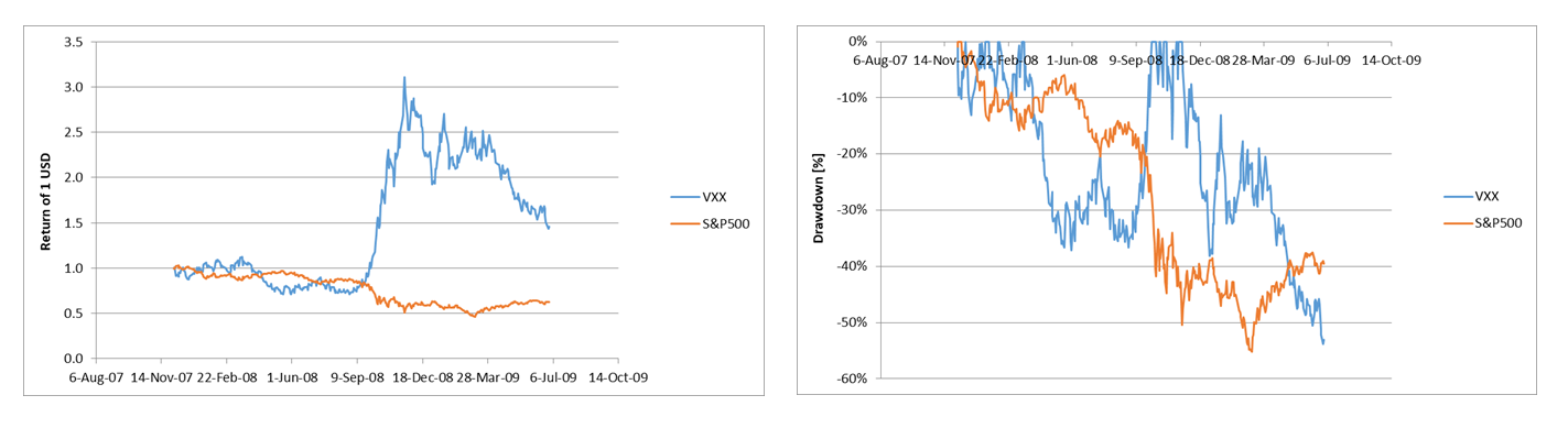 We need to be smarter than that. Because in my opinion investors (the ones investing a large part of their net worth in the financial market) can tolerate at most 10-15% maximum drawdown. How to get there? VXX like ETPs derive their values based on the first two front months of the VIX term structure (http://vixcentral.com/). Understanding how these two numbers move relatively to each other and relatively to the equity market volatility (VIX) can give us an insight on the most probable movement of VXX like products. By doing so, during the 2007-2009 recession we could have boosted the return of our insurance product from ca. 50% to 130%. The drawdown would have been reduced from ca. 55 to 28%; see VXX Tactical line. Personally I am risk-phobic and over the years I have learned that my threshold pain is at 10% maximum drawdown. When I open a long vol trade, I tend to do it while allocating only part of the capital depending on the position of the first two front months of the VIX term structure. By doing so, I am able to control (in theory, we never know of future events) the max drawdown to ca. 10% (see VXX NEXT-alpha) while getting decent return on the investment. 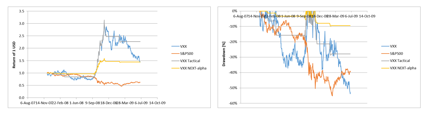 Over the last 18 years, this strategy would have performed nearly as good as buying and holding the S&P500 but with lower drawdown and higher Sharpe Ratio; see chart below. The strategy would have behaved particularly well during the March 2020 crisis. Pity that at that time it was not a part of the portfolio. I am convinced the chance will represent itself. 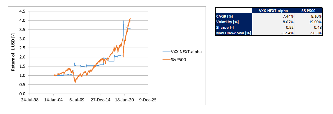 In conclusion, going long on volatility is a tricky trade but if properly calibrated it can provide a hedge during violent market pullbacks. I personally like this trade and it is part of my NEXT-alpha portfolio because in my opinion it provides a strong hedge when the fear in the market is elevated and a major sell-off has started.
This is how I hedge my portfolio. How do you do it? Comment below. What The Investor Should Expect? I am an algo trader and I work predominantly with equities and volatility products because these are the assets I am mostly familiar with. A few days ago I came across an article stating that the size of the bond market is quite similar to the one of equities. Afraid of missing opportunities, I have then decided to investigate this asset class: 1- to get more familiar with this domain 2- to understand whether bonds should be a more active part of our NEXT-alpha strategy. First thing first was to understand the trade-off between CAGR and maximum drawdown. I started by downloading all the bond ETF tickers available on etfdb.com, did some basic calculation and scatter plotted the CAGR vs. the maximum drawdown; see chart below. If you decide to do the analysis yourself, keep in mind you have to use the adjusted close price (i.e. the close price adjusted for the bond yield). The first thing that caught my attention was that investing in bonds can come with a risk! In some cases the drawdown can be higher than what I believe is the max pain threshold of a responsible investor; 10-15%. Whoa!!! 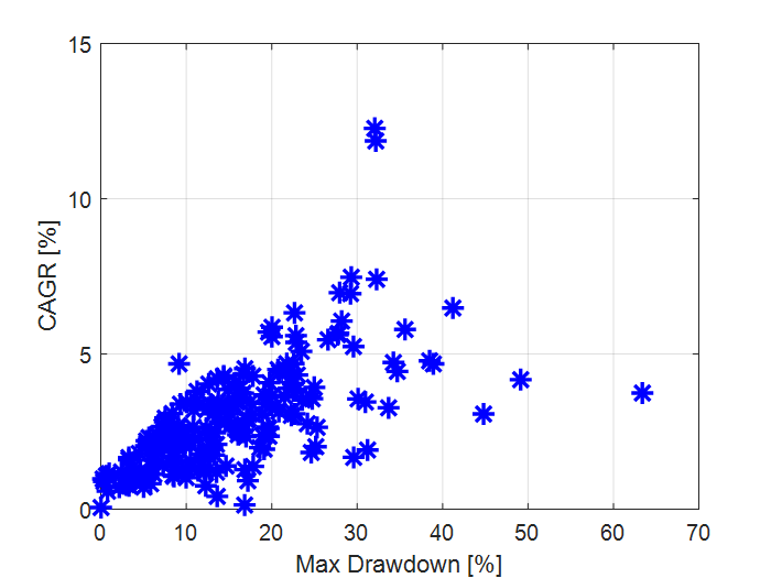 What next? I have then screened the bonds ETFs using two filters: 1- the historical data should trace back at least 9 years 2- the maximum drawdown should have been less than 10%. 10% was chosen because, personally this is what I can tolerate for my portfolio and my clients. By applying these two filters, the bond ETFs database shrinks from 493 tickers to 32. The question now is: what would be the return of a portfolio made solely of bonds? To do that we need to further screen the remaining 32 tickers to eliminate the ones that are highly correlated to one another. i.e. it is pointless to have in the portfolio the e.g. “iShares 0-5 Year TIPS Bond ETF” and “PIMCO 1-5 Year US TIPS Index ETF” at the same time since essentially they are the same instrument. We do that and we have 14 tickers left: 97% less than what we started with! If of interest the list is:
Now that we have the final shortlist, we can combine the timeseries using a Sharpe parity approach and a Risk parity approach. The results are presented in the table below. For reference the last column refers to the benchmark index tracked by the ETF AGG (Core US Aggregate Bond). On a risk adjusted basis (Sharpe ratio and CAGR-Max DD ratio), the two proposed portfolios behave better than the benchmark. From the point of view of absolute return then the proposed portfolios lag behind. Because of my risk aversion nature, personally I would prefer investing in the two proposed solutions. 0.49 as Sharpe ratio in my opinion is not worth. For folks used to equities like returns, 1 to 2% CAGR might not seem much but we have to keep in mind that the volatility and maximum drawdown of the portfolio is low. On the other hand on a risk adjusted basis (e.g. Sharpe Ratio), such portfolio shows a value below 1. Not substantially better as compared to equities. 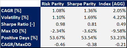 Given the findings, would I invest a larger part of the NEXT-alpha portfolio to bonds?
In short not right now. There are two main reasons behind this answer:
If in the future the 10 year US T-bond yields would settle above 4 to 5% and if the inflation goes back to its historical trend, then it might be time to put some money into the bond market. What do you think of investing in bonds? How do you approach the bond market? Type your comments below! The March 2020 equity market crash has created an unprecedented situation. In an already low bond yield environment, the Federal Reserve lowered the T-bond yield even more (temporarily) and in an attempt to re-launch the economy the money stock index was increased by 26% in 2020. As result of this, the equity market recovered fairly quickly but at the same time inflation also increased as result of the increase in money stock. With higher inflation the real bond yield turned negative thus becoming an unattractive asset to invest in. How can now the US debt be financed? Increasing the money stock even more can create a run-away effect. This is because increasing the money stock will increase inflation that will make the real bond yield even more negative (assuming the nominal value does not change) thus in any subsequent step the money stock should increase even faster together with the inflation. If on one hand it might seem that there is no way out from the current spiral, on the other hand in this article, I’ll examine a path forward that might bring to a way out from this cycle. The analysis will look into the most appropriate increase of T-bond yield to contain the inflation between 2-4% per year and the most appropriate increase in monthly money stock to avoid an equity market pull-back as result of the increase in bond yields. Remember: T-bond yield and the money stock index are levers. What happens to the equity market and inflation is a consequence of moving these two levers. This is not an obvious path forward. As result models have been built to analytically provide guidance on the most appropriate way forward out of this increase in inflation and equity market overvaluation. Before digging into the analysis, let’s look at some historical data. Figure 1 shows the money stock index variation on monthly basis between 2006 and 2021. In the chart, it can be noted that this parameter spikes during economic downturn. This is usually done as a way to sustain the economy during periods of downturn. During the 2007-2009 economic crises, the money stock reached a peak value just above 2%. Nothing compares to what happened in 2020 when it spiked to 6.5%. In this period its mean value has been calculated to be 0.49% while its median value 0.62%.  Figure 1: Money stock index variation month over month The nominal 10Y T-bond yield is shown in Figure 2. It can be noticed that it has steadily decreased in value since 2006. Occasionally it has sharply dipped for a few months as result of temporary economic downturns. In 2020, the T-bond has experienced its lowest historical value well below 1%. 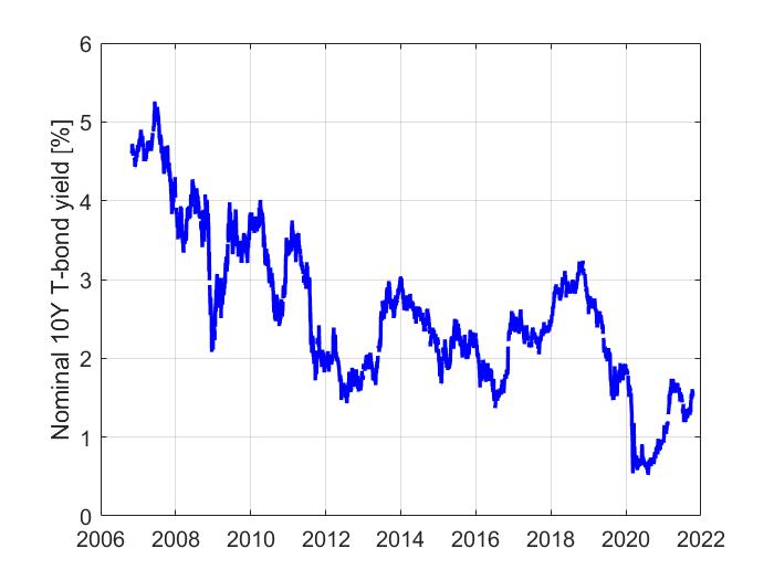 Figure 2: Nominal 10Y T-bond yield as function of time In Figure 3 it is presented the annualized monthly inflation calculated from the consumer price index. Usually this number spikes during economic downturns. It reached a peak value of ca. 12.5% during the 2007-2009 economic crises and the 2020 COVID pandemic. Its median value has been calculated to be 2.32%. The black line in the chart represents the real 10Y T-bond yield; i.e. the nominal value compensated with the inflation. As result of the increase in inflation, this number has been in the negative territory from 2020 onward. This is somewhat unprecedented when compared with the historical data preceding 2020. Its long term median value was computed to be 0.25%. 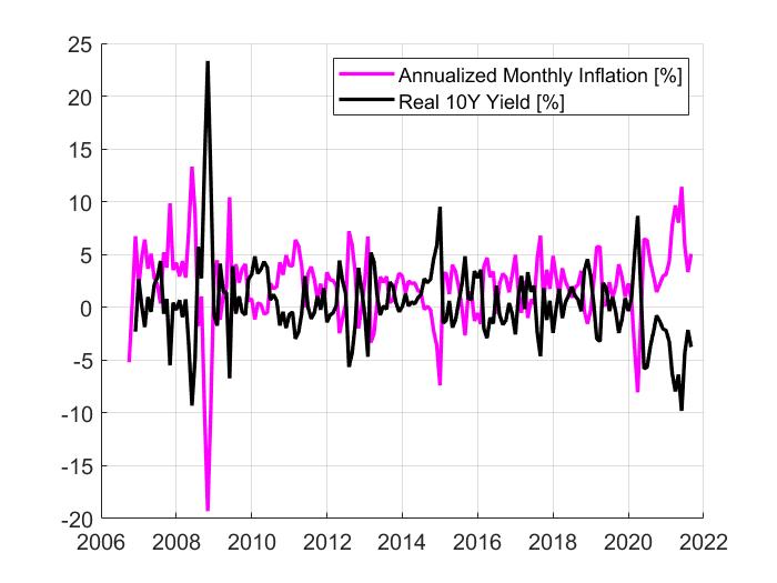 Figure 3: Annualized monthly inflation and real 10Y T-bond yield as function of time The US industrial production as function of time is shown in Figure 4. It can be noticed that it dips during downturns (as expected) and it has not reached new peaks after 2007. This is highlighting that the growth of the equity market is predominantly due to an increase in money supply. 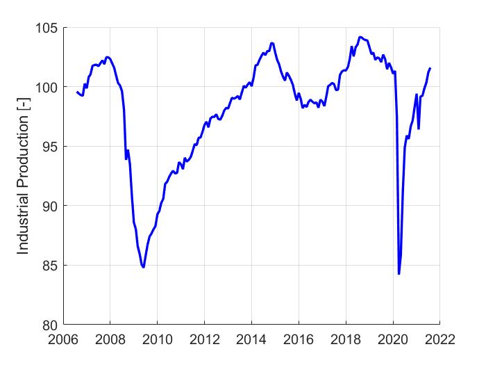 Figure 4: Industrial production as function of time To perform this analysis, it was necessary to build two models to evaluate the consumer price index (CPI) and equity market valuation (S&P500). These two models are an improved version of what it was presented in [S&P500 Mode Reference], [CPI Model Reference]. These two models now take also as input the nominal 10 year T bond yield. More specifically, the CPI was modeled as function of: money stock, velocity of money, unemployment rate, industrial output and 10Y nominal T-bond yield. The S&P500 was modeled as a function of: money stock, velocity of money, unemployment rate, industrial output, 10Y nominal T-bond yield, consumer price index and gross domestic product. I am going with the assumption that the nominal bond yield has to increase to contain the inflation while the money stock has to increase to avoid an equity market pull back. I am also assuming that it is targeted real T-bond yield to be in the positive territory; 0.25 to 0.75%. This is an important assumption. When the real bond yield is positive then they become an interesting asset for the investors to purchase thus effectively ending the vicious cycle of the Federal Reserve steadily increasing the monthly increase percentage in money stock. Some other relevant assumptions have been made to run the models and generate the charts presented below. More specifically, it is assumed that: unemployment, M2V and industrial output will stay at the same level at the time, the article was written. This decision was taken to focus on the most important parameters of the analysis and avoid going on the tangent. When it comes to GDP, it is assumed that its nominal value varies at the same rate of the CPI month over month variation. The just mentioned CPI is the one calculated using the model. Figure 5 shows the nominal bond yield as function of time predicted with the simulation. The three numbers in the legend should be interpreted as follow. The first number represents the monthly increase of the money stock index. The second number represents the quarterly basis points increase of the 10Y T-bond yield. The third number represents the targeted 10Y real bond yield. In the simulation, it was assumed that when the calculated real 10Y yield reaches its targeted value then the nominal one does not increase. In the figure, it can be observed that in order to keep the inflation between 2 to 4% while reaching a positive real yield value, it can be expected for the nominal T-bond yield to increase from the current 1.52% to a value between 2.5 & 7.5%. 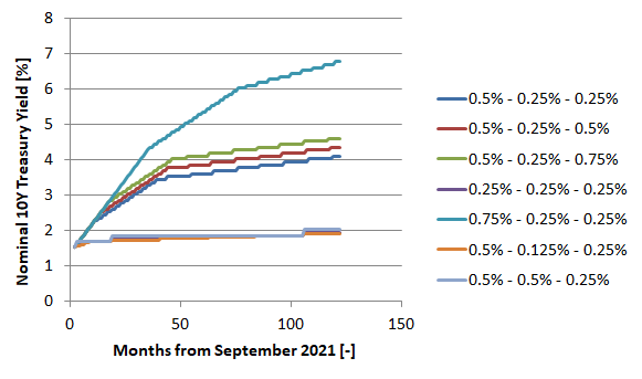 Figure 5: Modeled nominal 10Y Treasury yields as function of elapsed months In Figure 6, it is shown the value of the S&P500 calculated in the simulations relative to the September 2021 market price. The numbers in the legend follow the same logic as Figure 5. The way to read this chart is the following. Currently the market seems to be 18% higher in value than its fair price. With the parameters set in the simulations in terms of money stock and nominal yield, it will take between 25 and 75 months for the fair value of the S&P500 to reach the current value. We must keep in mind that this is a simulation that does not take into account the equity market dynamic. It is not unlikely that in the next 25 to 75 months, the market will experience a pullback followed by some uptrends as result of investors’ behaviors. The message I am trying to convey is that the current valuation is “fair” only if in the next 25 to 75 months the money stock increases between 0.5 to 0.75% per month and the Treasury yield increases between 0.25 and 0.75% points every quarter. 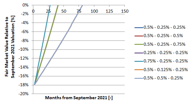 Figure 6: Ratio of the modeled S&P500 and the September 2021 value as function of elapsed months In conclusion to this article. Many people might think that we are going to experience a period of stagflanation as result of the generous fiscal stimulus and very low T-bond yield. If on one hand this might be correct looking at the situation as it is now, on the other hand in this article it is shown that by carefully increasing the bond yield and simultaneously the money stock index, it is then possible to simultaneously control the inflation to 2-4% per year without creating the conditions of a major pullback of the stock market. In the article it is indicated that 28 to 80 months might be required to stabilize the situation while having the money stock monthly increase and the bond yield to ca. 2006 levels.
If you are a quant investor or a wanna be one, the first thing you do is to define an investment strategy, backtest it and eventually launch it live. How many times have happened that the strategy has not performed on a real or demo account? If the answer is nearly always, let me explain you why it has happened and let me suggest you what I think is the best way to perform a backtest prior launching your new strategy live. There might be four main reasons why your backtest did not work in real life:
Assuming you have not done any mistake in setting up the equations and you are patient enough, most likely, your strategy did not work in real life because your model is over-fitted. With the term “over-fit” I mean that the model knows quite well how to behave if the past would exactly represent itself while it would partially/total fail if future events are not exactly the same as past ones. Let me illustrate this with an example. Imagine you have figured out the importance of rotating your investments among uncorrelated asset classes depending on the market conditions, now what you will try to do is to define some rules that will tell you in which asset class to be invested in. It is 2021, so you decide to use Machine Learning and more specifically you define a classification problem. Typically a classification problem tells you what to select depending on a given set of input variables. Input variables that in the case of investing could be: market volatility, return of a given asset, volatility of a given asset,… You then take your Python or Matlab software, build your model, train your data and… you are astonished by the outstanding performances of your strategy. I did the exercise and I have assumed that the strategy rotates among three asset classes: US T-bond, gold and US equities. I have then assumed that my holding period is between one week and one month. The result:  You’ll then get super exited because when you look at the backtested data, you know that in no time you’ll be rich and you are confident enough that the strategy is robust enough to survive a market crash because your model was also trained with data including bad years like 2007, 2008 and 2020. What next? You go to your brokerage account, start implement the strategy, the first month does not go as expected, so you say that it was a one-off. Then eventually there is an equity market downturn and your drawdown is higher than 15%, you lose money and you: in the best case ask yourself what has happened and in the worst case you blame the rigged market. What went wrong? Long story short: your model is over fitted and this is not the way you run a back test. The way I personally run a backtest is to mirror exactly what I would do in real life. If I have to take an investment decision in e.g. March 2016, the data I would have in real life to train my model are the ones available up to March 2016 and not September 2021. The way that a backtest should be structured is to iteratively train your model within the backtest. By doing so, your model is still over fitted (assuming we are still dealing with the previous example) but the outcome of using it is closer to what would happen in real life. The differences would be due to e.g. fees, orders slippage,… By running a backtest in this way, the performances of the strategy are now: 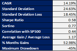 A huge difference is not it?
In my opinion, this is the most appropriate way to backtest a strategy and provide a very good idea on how your investment would perform in real life without losing money while implementing a possibly over fitted investment strategy. I hope you find it useful and you have learned something new, to the next time! In 2021 the S&P500 has grown 14.10% (06/25/2021). Fear as result of Treasury bond yield and inflation increase has led many to believe that the equity market is heading downward. We share the same opinion. We have developed 24 different possible scenarios for the next 6 months. All of them are expecting the S&P500 to drop at least 19% and at most 23% by the end of 2021. The fair value of the S&P500 was estimated using our proprietary model described in more details in here. We have then estimated the year end value of the macroeconomic parameters used to feed the model under different assumptions. The model inputs and their expected values under different scenarios are described below. US Gross Domestic Product (GDP):
M2 US Money Stock:
BAA Corporate Bond Yield Relative to Yield on 10-Year Constant Maturity (BAA-10Y):
US Consumer Price Index (CPI):
A full factorial combination of the different estimates of the parameters used to feed the model resulted in 24 different scenarios to estimate the S&P500 value by the end of the year. In Table 1 it is reported the value of each parameter used in each scenario and the estimated fair value of the S&P500 by the end of 2021. The upper and lower estimated have been calculated assuming plus/minus 2 standard deviation. Table 1: Expected value of the S&P500 by the end of 2021 under different scenarios. 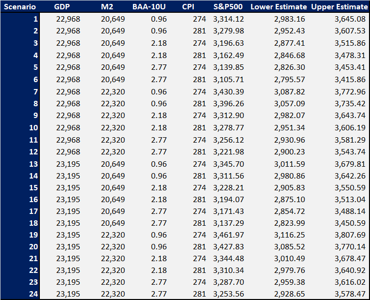 In conclusion: given the current economic environment and the expected macroeconomic trends, according to our model, it is expected that the S&P500 might close 2021 between 3,050 and 3,462. The question is: is this going to happen? We need to keep in mind that there is a difference between fair price and actual price. As long as there are buyers, prices can stay where they are or even go higher. This can be noted during the Dotcom bubble in which there has been a large discrepancy between actual and fair value of the S&P500; see Figure 1. But… if there is an event that will trigger a sell-off then we know where the index might land.  Figure 1: Actual and modeled S&P500 index; reference here.
The first quarter of 2021 has been quite eventful. One of the situations that has somewhat shaken the equity market has been the rise in bond yields. More precisely the 10 year bond yield has been raised from 0.93% to 1.64%. There have been a large number of interviews in which it was stated that a rise in yield would have spelled the end of a rise of the equity market. Is this really true? Not in my opinion. The 10 years Treasury bond yields are loosely correlated with the equity market. Between 1960 and 2020, this correlation has been 5.35%. This loose correlation is more evident in Figure 1. In some years there is a positive strong correlation while in some others, the opposite happens. 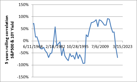 Figure 1: 5 years rolling correlation between the S&P500 and the 10Y Treasury bond yields. What should we really fear when it comes to yields? According to our S&P500 model (link to the article here), problems might start when the corporate bond yield increases much faster than the 10 years Treasury bond yield. All being equal, 1% point increase in spread between corporate and Treasury bond yield results in a 2.48% decrease in value of the S&P500; see Figure 2. Personally, I would rather track the evolution of this spread rather than the actual value of the Treasury bond yields. Investing in bonds could be convenient only if the yield is higher than the long term return of the S&P500; ca. 10%. From 1960 to today, this only happened between 1979 and 1985; link in here. 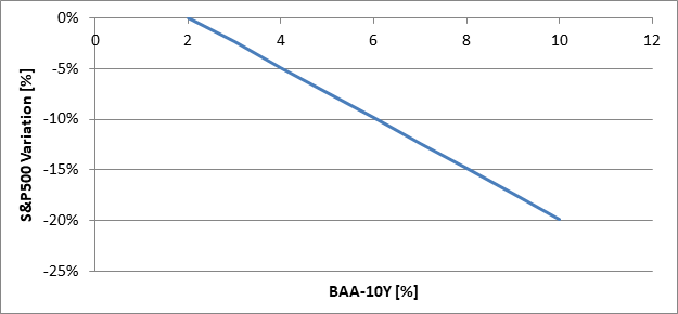 Figure 2: Relationship between the S&P500 and the corporate-Treasury bond yield spread. It is assumed that all the other macro-economic factors are constant. The second and not least important hot topic of 2020 and 2021 has been the money supply. 40% of all US dollars were printed in the last 12 months. What does that mean for the equity market? According to our S&P500 model, increasing the money supply (M1) results in an increase in value of the S&P500. For each 1 trillion dollar of additional money printed, all the rest been equal, we can expect a 6.96% increase of the S&P500; see Figure 3. This is assuming that the money that were printed will end up in the hands of business owners. 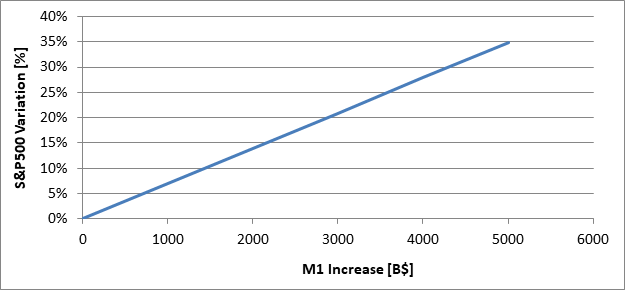 Figure 3: S&P500 variation as a function of the money supply (M1) increase. The situation could be somewhat different if the new money would reach the general public rather than business owners. This can lead to an increase in inflation. For each 1 trillion dollar of additional money printed, all the rest been equal, the consumer price index can be expected to rise by 7.45%; see Figure 4. With this happening, the S&P500 might experience and increase of 3.88% for each additional trillion of dollar printed. The increase in equity market value will not compensate for the increase in inflation. Even the money invested into the financial market will not be spared by inflation. 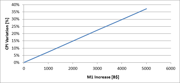 Figure 4: CPI variation as a function of the money supply (M1) increase. What is the tipping point? If the tipping point is defined as the percentage of money given to the general public when the increase in inflation is equal to the increase of the S&P500 then the tipping point is ca. 60%; see Figure 5. 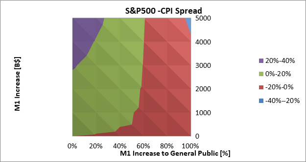 Figure 5: Spread between S&P500 and CPI as a function of the money supply increase and money provided to the general public.
We now might have a better understanding of the influence of yield spread and money supply on the equity market and consumer price index. There are lot of news out there that might induce fear and urge to change asset allocation. My advice is: take a step back, look at the situation as objectively as possible, filter the noise, look at similar past events and with the best analytical approach, take decisions as objectively as you can. When it comes about protecting the portfolio during downturns, I often I read about diversification either using a combination of uncorrelated asset classes or through equities ETFs that cover different regions of the World. Does it really work? When sell-offs start and the fear gauge (VIX, the volatility index) spikes, all of a sudden loosely correlated equities ETFs become correlated; see Figure 1. This means that if the broad market goes down and the correlation is nearly 100% then all the rest goes down. Diversifying through equities ETFs that cover different regions of the World is not really helping when we need it the most. The same is true when diversification is done across different sectors. 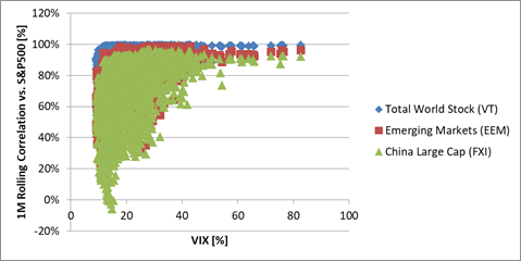 Figure 1: 1 month rolling correlation between the S&P500 and three others equities ETFs. How about diversifying using different asset classes? If we thing about investing in gold, medium term bonds (e.g. IEF) and equities (e.g. SPY) and allocate capital based on the risk parity methodology, definitely the maximum drawdown is reduced during downturns. For instance when in 2020 Q1, the S&P500 went down by nearly 35%, this allocation would have experienced a maximum drawdown lower than 7%. Unfortunately everything has a cost and this strategy has the drawback of very low annualized return: 3.36% vs. the 15.52% of the S&P500 (2009-2021). What to do about this? Can we break the trade-off between annualized return and the maximum drawdown? VXX, the VIX short term future ETN, might do the trick and help out our portfolio. By the way it was designed, VXX decays over time. Buying and Holding this ETN is a financial suicide; see Figure 2. The good news is that when the market crashes, this ETN spikes in value. For instance between February and March 2020, in the panic of the pandemic, VXX increased by 436% while the S&P500 dropped by 35%. 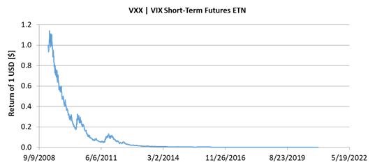 Figure 2: Buying and holding VXX. How to take advantage of these spikes? The first thing to do is to understand when to enter a long position in VXX. To do that we must look at the VIX term structure. This chart can be found on vixcentral.com and is shown in Figure 3. Each dot represents a VIX future value while the dashed line represents the VIX spot price. If all the future contracts values are pointing upwards and the spot VIX is below the futures then no major sell-off can be expected. Troubles can be expected when the first front two months are ca. 10% below the VIX spot value. If this happens, it is highly probable that a major sell-off is underway and it will continue even stronger in the next few days. When this happens then the VXX ETN spikes quite rapidly. For the sake of brevity, lot of information on how to read the VIX term structure have been omitted. 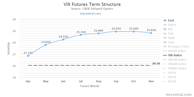 Figure 3: The VIX term structure on March the 29th 2021. By knowing that the VXX spikes when the first two front months are ca. 10% below the VIX spot price, assuming our portfolio is made 100% of equities, then we can think of taking part of it and allocating it to a long volatility position. Table 1 shows the CAGR and maximum drawdown as function of the percentage of the portfolio allocated to a long volatility position. It is assumed that the investor sells all the equities positions as soon as the first two front futures are 10% below the spot price. In this example, it is assumed that the equities are represented by the S&P500. Table 1: annualized return of investment and maximum drawdown as function of the portfolio allocation to a long volatility trade. 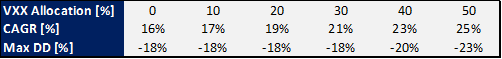 By allocating 30% of the portfolio to a long volatility trade is effective in maximizing the annualized return while minimizing the drawdown. In the same period, buying and holding the S&P500 would have resulted in an annualized return of 15.3% and a maximum drawdown of 34%. The backtest of this optimal case is shown in Figure 4. 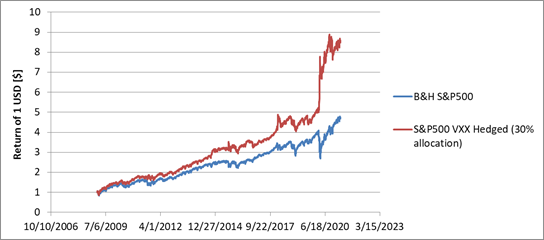 Figure 4: Equities portfolio hedged with a long VXX position versus buying and holding equities.
In conclusion, diversification is not protecting our portfolio when we need it the most. Equities become all correlated when the market goes down. Diversifying using different asset classes can reduce the drawdown but the long term return is penalized. By wisely opening long volatility positions when the equity market sinks can provide an effective hedge to reduce the maximum drawdown while improving the annualized returns. In this article we propose a methodology to pick-up stocks. The method consists in creating a portfolio of 10 stocks. The stocks can be taken from the components of the S&P500 or Nasdaq 100. The securities are selected based on their return of investment over a certain number of months. Six months if the stocks come from the S&P500 components while three months if they are from the Nasdaq 100. The stocks are then hold 10 days if they are selected from the S&P500 constituents or six months if they are taken from the Nasdaq 100’s basket. Selecting stocks can be a very complex and time consuming task. Even when automatized, valuing a company can be a challenge and the return of investment on a company can be heavily influenced by the sentiment of the market. GameStop can be a textbook example of this situation. In this article we propose a methodology in which a portfolio of stocks is selected based on their past returns. The method is made of three parameters that have to be optimized in order to maximize the portfolio return with an acceptable maximum drawdown. These variables are:
Selecting Stocks Using the S&P500 Components In Figure 1 the return of investment as function of the maximum drawdown is presented. The lowest maximum drawdown is ca. 46-47% which is not substantially lower than buying and holding the S&P500; ca. 57% in the last 20 years. The return on investment can be highly amplified using this stock picking methodology. In the best case, the highest annualized return of investment with a maximum drawdown not exceeding 50%, is 33.32% vs. 8.77% of the S&P500. 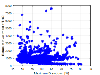 Figure 1: Return of investment as function of the maximum drawdown for all the runs using the S&P500 components. Increasing the CAGR by 3.8 times can be done with:
Table 1: key statistics of the proposed stock picking approach and the S&P500. 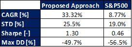 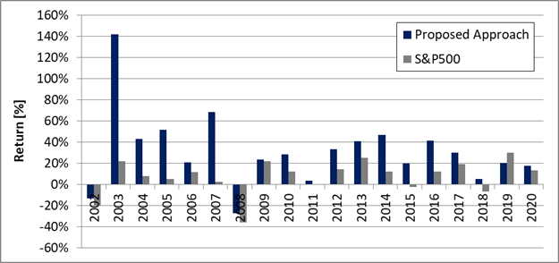 Figure 2: Annualized returns of the proposed stock picking approach and the S&P500. Selecting Stocks Using the Nasdaq 100 Components Figure 3 shows the return of investment as function of the maximum drawdown. The lowest maximum drawdown is ca. 35% which is lower than buying and holding the Nasdaq 100; ca. 56% in the last 20 years. Assuming we try to maximize the return of investment with a maximum drawdown lower than 50% then this methodology allows achieving an annualized return of 41.79% vs. the 12.97% of the Nasdaq 100. 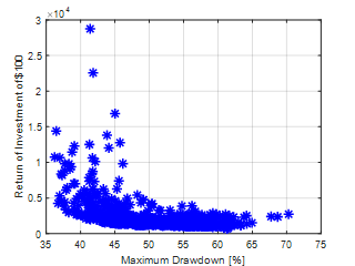 Figure 3: Return of investment as function of the maximum drawdown for all the runs using the Nasdaq 100 components. Increasing the CAGR by 3.2 times can be done with:
Table 2: key statistics of the proposed stock picking approach and the Nasdaq 100. 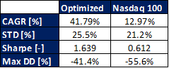 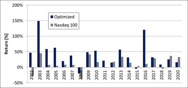 Figure 4: Annualized returns of the proposed stock picking approach and the Nasdaq 100. Comparing to Berkshire Hathaway One of the greatest stock pickers of all the time is Warren Buffet, how would this methodology compare to the returns of Berkshire Hathaway? The answer is provided in Table 3 and Figure 5. Despite this strategy hypothetically behaves better than the performances of Berkshire Hathaway, it is important to keep in mind that these conclusions were drawn assuming that there is no bottle neck with this strategy in the ability to purchasing whatever stock. Table 3: key statistics of the proposed stock picking approaches, Berkshire Hathaway and the reference indexes. 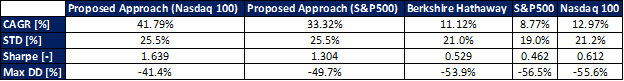 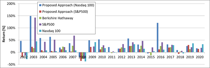 Figure 5: Annualized returns of the proposed stock picking approaches, Berkshire Hathaway and the reference indexes.
Stock picking can be a very complex and tedious work to perform. In this article, it was proposed a methodology to select stocks based on the company momentum. The optimal number of stocks and holding duration was also discussed. The methodology allows increasing the annualized returns by 3.2-3.8 times versus the benchmark indexes while keeping the maximum drawdown below 50%. Cash is trash. Considering all the money that has been printed by the Federal Reserve in 2020, this strong statement made by Ray Dalio in 2020 is more than justified. The questions are: what rate of inflation should we expect? Is there anything we can do about it to protect our hard earned money? In this article we will:
Inflation is not just about money printing, there are three more factors affecting its value. CPI could be thought as a function of: money stock index (M1), velocity of the money stock (M2V) (i.e. how fast money changes hands), unemployment rate and industrial output. Increasing these four independent variables increases the inflation. A simple linear regression model was built using these parameters. The model has an accuracy of 99% (R2) and a P-value below 0.05 for all the regression coefficients. Two times the average error between modeled and actual data has been calculated to be 7.18%. The actual and modeled CPI is shown in Figure 1. 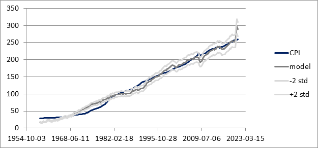 Figure 1: Actual and modeled consumer price index. Where is the inflation heading? To answer to this question, we need to understand the value of all the variables affecting the inflation by the end of 2021. It is estimated that M1 might reach a level of 8.2 trillion dollars. The estimation is based both on the current trend as well as the stimulus package announced by the Government. Due to the current restrictions and “normal” life not expected to be back before 2022/2023, it is estimated that M2V will not increase in value and stays relatively flat at 1.13 throughout 2021. The unemployment level has been drastically decreasing in the last few months. If the trend continues, it will not be unlikely that it might reach 5.7% by the end of 2021. The unemployment will not reach the pre-COVID levels because, due to the current and projected restrictions, several sectors will not be able to operate again at full speed. The industrial output is expected to increase by 3.5%, reaching a value of 107.23 point. For the same reasons mentioned so far, not a full recovery from its peak value of 110.11 points . Given these assumptions, using the above mentioned model, it is estimated that by the end of 2021, the CPI might reach 353 point: 35% higher than the current level (261.78). If the prices would increase by 35% by the end of 2021 (or even a fraction of this estimate), this would mean that the cash in our bank accounts might lose its purchasing power. To make an example, imagine you have $50,000 in your saving account in 2020. By the end of 2021, the purchasing power of this $50,000 would be equivalent to $32,500 ($50,000 * 35%). By now the statement “cash is trash” should make more sense. What to do about it? Bond yields are currently very low; ca.1.25%. It would roughly take 35 years to recover this inflation loss while assuming there will not be any inflation increase in the future. Not the best way to go. How about investing in an index fund that follows the S&P500? To do that we have estimated the value of the S&P500 based on: gross domestic product (GDP), medium term Treasury bond yield, CPI, M1, M2V, unemployment rate and industrial output. This linear regression model is an updated version of the model we have presented in this article; link here. Assuming that the GDP will rise by 1.0% in 2021 while the bond yield will stay at 1.25% then it is estimated that by the end of 2021, the S&P500 should be valued: 3,488 points plus/minus 12.52%. The current market value of the S&P500 is 3,901 points. This means that the equity market might not be the most suited place where to put your hard saved money. What is left? Bitcoin and gold. I’ll focus on the yellow metal since my competencies on crypto currencies are limited. Our linear regression gold model takes as independent variables: the S&P500 value, M1 and CPI. More details on the model can be found in here. With the numbers estimated so far, gold might reach by the end of the year 3,857 USD/oz plus/minus 279 USD/oz. Currently gold is at 1,844 USD/oz meaning that there is an upside potential of 209%. The number is high enough thus offering an effective protection mechanism against the damage that a potential increase in inflation might create. Because the current conclusion is based on several assumptions, a sensitivity analysis has been done on the assumptions that have been made. Table 1 shows the sensitivity boundary values of each of the six variables. A total of 729 combinations were created and analyzed. In Figure 1 and Figure 2, it is shown the estimated value of the S&P500 and gold as a function of the estimated value of the CPI at the end of 2021. These three parameters have been normalized relative to their current levels. Figure 2 shows that the CPI might increase between 15 and 45%, unfortunately in the vast majority of the cases the S&P500 would have a negative return in 2021; at worst -20%. Gold, Figure 3, shows that might experience an increase in value between 60 and 120%. The sensitivity analysis still support the main finding: inflation might increase and gold should be the best asset to invest in and avoid that our money will lose their value. 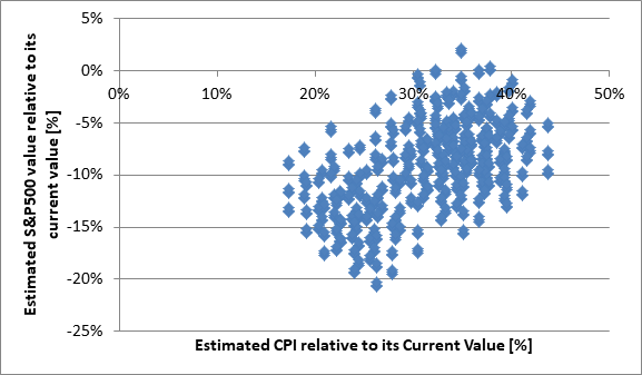 Figure 2: Estimated CPI vs. estimated S&P500 value both relative to current valuation. Scatter plot of the sensitivity analysis. 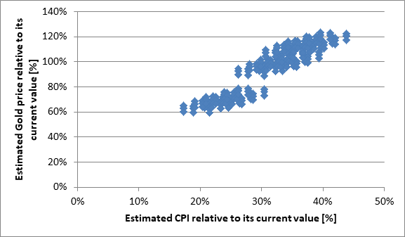 Figure 3: Estimated CPI vs. estimated gold price both relative to current valuation. Scatter plot of the sensitivity analysis. Table 1: Sensitivity analysis boundary values for the variables used to estimate: CPI, S&P500 value and gold price. 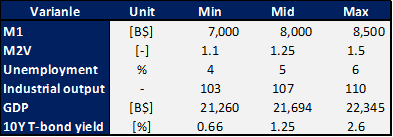 In conclusion, in this work we have presented that is possible to model the consumer price index. The model indicates that by the end of the year the inflation might substantially increase as result of the money that has been printed, industrial output and unemployment. To avoid losing the value of the money, investing in bonds or the S&P500 will not provide a hedge. It is projected that the S&P500 might lose ground in 2021. Gold offers an effective hedge against the projected rise in inflation. The estimated increase in gold value should more than balance the decrease in value of the cash due to the rise in inflation; it will actually result in a value increase of the invested capital.
I was born in 1981 and my first year of college was 1999. What if my parents would have decided to invest 25 $/month from the time I was born to the time I started university? For sure they would have experienced the dot-com bubble. The Dollar Cost Averaging (DCA) approach would not have survived well: the market dropped by ca.50%, the recovery took ca. 7 years and exactly the same would have happened to my saving account; see light green line in the first image below. Why did it happen? Sure, the market has its cycles but basically there are a few things that could have been done to mitigate what happened during the dot-com bubble and the house market bubble crises. First: the amount of money that is injected in every DCA should constantly increase over time. Let’s say our parents are generous and they get a few promotions over the years, we can then assume that they would increase the amount of money they donate by 7.5% per year. By doing so, they would have managed to reduce the drawdown duration by 1.5 years (5.5. years in total) while, unfortunately, the drawdown would have stayed at ca. 50%; see dark blue line in the first image below. The second thing that they could have done, it would have been not to put all the eggs in the same basket and diversify the asset allocation. In this example I have chosen 60% equities (S&P500) and 40% medium term T-bonds. Surprise, surprise, they would have now been able to experience 22.5% max drawdown during the dot-com bubble for a duration of 3 years. Much better right? Moving forward in time and we get the house market bubble. This time we get a steeper drawdown (35%) while a recovery time of 1.4 years. In comparison, it took ca.5 years to the S&P500 to get back to the previous high. 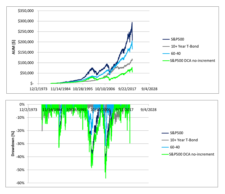 What did we learn so far? DCA is not a magic bullet to navigate through difficult times. The market goes through cycles and when they happen, it is better to be prepared. Preparation means: implement DCA, diversify your assets and steadily increase the amount of money you place each month in the brokerage account. Lastly and most importantly make a few calculations to verify that your plan is solid. Yes, the S&P500 returns an annualized 10% but do not forget that there are market cycles. These cycles might take several years to recover and we definitely do not want to lose capital when we need it the most. If we now want to improve our drawdown even more, there are ways to do that. Somewhat complex and counterintuitive but worth. What are these tricks? First the split between equities and bonds can be adjusted over time. When we are infants we do not need money so our parents can invest in riskier assets e.g. 100 equities. As we grow up, we slowly start investing more and more in bonds. In this new example 40% after 40 years. To further improve the performances of the account, it is beneficial to add more money when the market goes down and less when it goes up. By doing that our return on investment is very similar to the 60-40 case but this time, the maximum drawdown is 24% while its duration 1.2 years. See dark blue line below. Better, is not it? 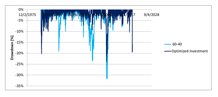 I am very tempted to talk about NEXT-alpha and make a case study around it but today I’ll skip it. It does not sound fair for the equity market. But it is important to keep in mind that there might be better strategies out there other than the traditional equities-bond allocation.
This article was written after opening a brokerage account for my 3 years old toddler and make him benefit of everything I have learned in the last decade. Would not be awesome to double your return of investment while decreasing drawdown and the volatility of the portfolio? I bet everybody would like doing that. So let me share a lesson I learned a bit late in life. Never too late to learn and if applied at younger age, well… later in life you might find yourself with some good money in your brokerage account. Imagine you have $5,000 and you want to make this money grow in the market. Depending on your risk tolerance you might choose to allocate a part of this money to equities and the remaining part to bonds. How much can you make? Let’s look at the CAGR of the first table below. In the upper row, the first number represents the percentage of medium term treasury bonds (ETF = IEF) while the second, the percentage of equities (S&P500, ETF = SPY). 100% equities would give you an annualized return of 9.12% (good) with a max drawdown of 52% (bad). 100% bonds would give an annualized return of 2.17% (bad) with a max drawdown of 11% (OK-ish). If looking for stability, we might want to allocate 60% to equities and 40% to bonds. How much my $5,000 would be worth in 15 years? $11,755. Sooo much waiting to add a mere $6,755 in 15 years. 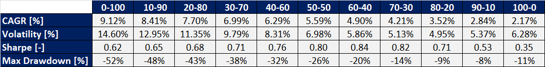 Do not you want to do better? Actually, there is a way to do it while still investing in the same instruments with exactly the same investment methodology. The trick is: add a little bit of money each month to your investments. In technical terms this is called Dollar Cost Averaging. Many of you might be familiar with this practice, despite, first: let’s quantify its potential, second: let’s see how to do this even better. Going back to the previous example. Let’s start investing $5,000, 60% in equities and 40% in bonds. This time, we add $250 per month to the brokerage account. Our annualized growth now increases from 5.86% to 117.79% with a maximum drawdown of 12%; see table below. After 15 years, the original $5,000 would have grown into $106,229.Better than $11,755, right? Yes! Of course this is not only thanks to the market. By adding $250 per month, you have actually contributed $45,000 ($250*12*15). The difference this time is: by combining the effect of the market and your ability to save money each month, you manage to create an actual growth of $56,229 (106,229-45,000-5,000). Definitely much better than the previous $6,755! 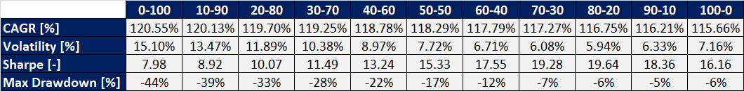 Can we do better than this? I bet we can! The way I do it is by investing in an actively managed strategy. NEXT-alpha is the flagship strategy of Alpha Growth Capital. The strategy returned an annualized 24.74% in its more than three years of life. By investing $5,000 in NEXT-alpha, without dollar cost averaging, after 15 years, the AUM would be worth $137,696. If we now add $250 per month, at the end of the 15 years, the account would be worth $1,123,211. Much better is not it?
Concluding: definitely getting rich over night with the stock market might be tough but… today we have learned that if we leverage the compounding potential of the market, combined with the ability to save and invest some money each month, by having enough patience, we can grow a small amount of money into something much bigger. I do it, why can not you? 😊 Traditionally the vast majority of market players focus their investment efforts in trading equities and bonds. This is because equities might enable high returns while bonds might protect the portfolio during bear markets. Alpha Growth Capital has traditionally focused in using predictive analytics to trade equities in its flagship strategy NEXT-alpha (https://www.alphagrowthcapital.co/next-alpha.html). In the quest to reduce the strategy volatility while possibly leaving the annualized returns unchanged, Alpha Growth Capital has explored the viability of investing in asset classes other than equities. In this article, we will explore the viability of trading commodities. Corn was taken as case study and the historical data from the Teucrium Corn Fund (CORN) were used to evaluate different trading methodologies. The results were finally compared to buy & hold the S&P500 using different risk matrixes. The following trading strategies were investigated:
A commercial software (Matlab) was used to perform a parametric optimization of all the three strategies to find the optimal value of each parameter for each indicator. The optimization was targeting the maximization of the return of investment. Trading fees and ask-bid price spreads were neglected in the optimization. In regards to the entry and exit signals: Trading Methodology 1: the position is entered when the ratio between the conversion line period and the baseline period exceeds a threshold level. The position is close when the ratio is below the threshold level. Entries and exits signals are evaluated just before the market closes. Trading Methodology 2: the position is entered when the Commodity Channel Index is above and given value and vice-versa. Entries and exits signals are evaluated just before the market closes. Trading Methodology 3: this is a proprietary methodology developed by Alpha Growth Capital for its core strategy NEXT-alpha. With this methodology, the price action is expressed as function of the volatility of the equity market (VIX) instead of time. Depending on the volatility level of the market: different intraday exit price levels are established for the position opened at the previous end of trading day, position size is selected and intraday limit and stop orders are set at a pre-determined price. Because of the contango/backwardation effect, buying and holding CORN from mid-2011 to December 2020 would have resulted in an annualized loss of 10.66%. When the conversion line is set at 8 days while the baseline line at 11 days, using a ratio threshold of 1%, the Trading Methodology 1 would have led to an annualized return of 5.04% with a maximum drawdown of 10.35%. With the second trading methodology, the Commodity Channel Indicator period was set at 3 while its threshold entry/exit level at 125. In this case the annualized return was 2.01% while the maximum drawdown 10.61%. The proprietary Trading Methodology 3 provided the best results. The annualized return was 16.62% while the maximum drawdown 17.55%. The risk adjusted return was the highest among the three strategies. An overview of the results is presented in Table 1. The simulated optimized price evolution for the three strategies is presented in Figure 1. Table 1: Comparison of the three optimized trading methodologies. B&H = Buy & Hold. CAGR = Compounded Annual Growth Rate. STD = Standard Deviation. 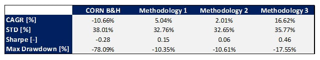 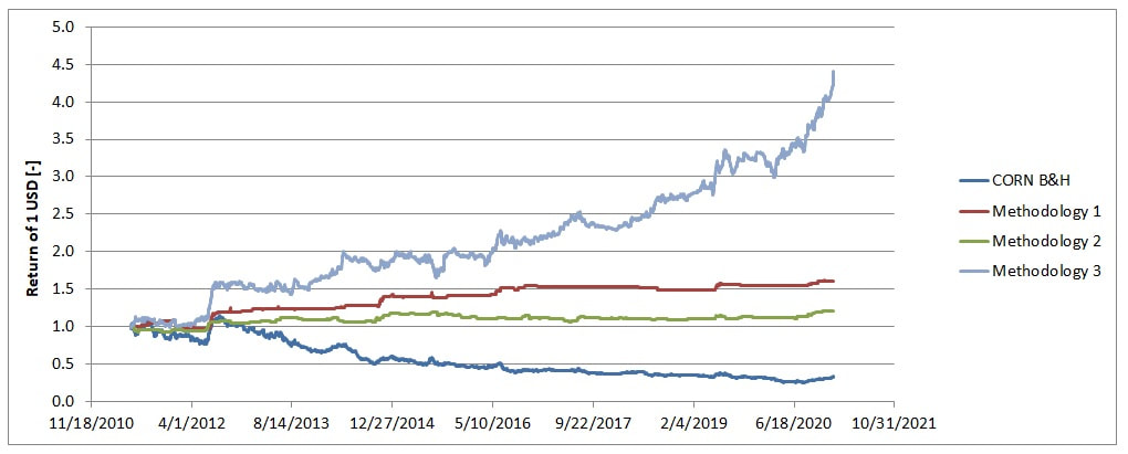 Figure 1: Simulated price evolution of the three optimized trading strategies.
The Trading Methodology 3 has emerged to be the winner. The question now is how it would compare to buying and holding the S&P500 (SPY). From mid-2011 to end of December 2020, the S&P500 has returned an annualized 10.48%, 33.92% as maximum drawdown and a Sharpe ratio of 0.60. In comparison this optimized strategy has delivered an annualized return of 16.62%, 17.55% as maximum drawdown and a SharperRatio of 0.46%. As compared to the S&P500, the optimized strategy improves both the return and the drawdown while the Sharpe ratio slightly deteriorates. As compared to NEXT-alpha, the Trading Methodology 3 shows both lower returns (29% vs. 17%) and lower drawdown (26% vs. 18%). If on one hand trading CORN might offer diversification on the other hand its implementation into the portfolio would lower the annualized returns of NEXT-alpha. In conclusion, this article has evaluated three different trading strategies to trade CORN. Trading based on the Ichimoku and the Commodity Channel Index indicators can result in positive returns vs. buying and holding CORN. Looking at the price action in the volatility domain and define appropriate entry & exit levels as function of the market volatility can provide even better results than the above mentioned two indicators. The optimized strategy enables to achieve 16.62% annualized returns while trading based on the Ichimoku and Commodity Channel Index indicators: 5.04 and 2.01% respectively. The optimized strategy also delivers better returns versus buying and holding the S&P500 over the same time frame. All of us are very familiar with the concept of time because this is something we experience on daily basis since the time we were born. As result when we deal with financial time series and we try to optimize them to reach our targeted CAGR, maximum drawdown,… we do that in the time domain. We download data from e.g. Yahoo Finance, we get our nice spreadsheet which is basically a series of data sampled on daily basis and then we work on it. With this article I would to show that there is a better way to optimize financial time series. I’ll do that with a case study about optimizing the daily stop loss value of the Nasdaq 100. In this example I have used the ETF QQQ. First: forget looking at the price action in the time domain. Second: start looking at the price action in the volatility domain. When I talk of volatility, I am referring to the S&P500 volatility which is typically measured with the CBOE Volatility Index (VIX). Let’s start with the case study. The research question is: what is the best stop loss to maximize the CAGR of the Nasdaq 100 (QQQ)? What most of the people would do is to find a single stop loss (SL) value to maximize the CAGR of the time series. When doing so, I get 0% as the most appropriate SL. This means that as soon as the daily price variation becomes negative or the market opens below the previous close then the strategy is in cash until the position is re-opened at the end of the trading day. With this approach, the CAGR increases from 8.53% to 10.23% while the maximum drawdown is reduced from 83 to 60%. Not too bad. Let me tell you that there is a better way to do that. This is by looking at the price action in the volatility domain. We can think of dividing the VIX in three equally spaced ranges; low, medium and high. For each of these ranges there is a daily price action associated with the Nasdaq. We can now think of optimizing the SL value for each of the volatility range. It might get somewhat complicated in Excel but it is worth the effort. If we do that, the optimal SL values are: 2, 1 and 0% for the low, medium and high volatility range respectively. The optimized time series will now have a CAGR of 11.67% while a drawdown of 66%. The CAGR increase by 3.14% points vs. the baseline case. This might not seem much but over a 20 years investment period this means to nearly double the returns at the end of this 20 years’ time. The key statistics and time series for these three different investment approaches are presented in Table 1 and Figure 1 respectively. 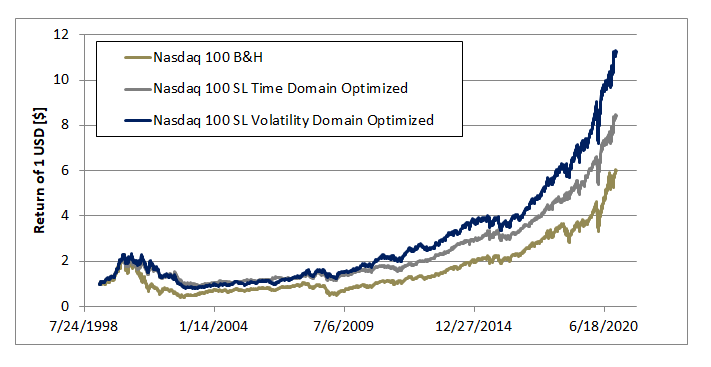 Figure 1: time series for the three different investment approaches. Table 1: key statistics for the three different investment approaches. 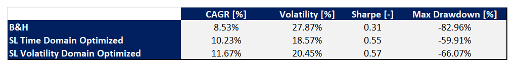 It is clearly advantageous to look at the price action in the volatility domain. Optimizations can take place in several shapes like e.g. looking at minimizing the max drawdown or finding the highest CAGR for a targeted max drawdown or splicing time series depending on the volatility level. In this article for simplicity we just looked into maximization of the CAGR but I ensure you that there is much more that can be done.
Large and small investors are quite often faced with the question: where is the equity market heading? Generally speaking nobody knows what will happen tomorrow or in a year from now. I am confident that any of the reader did not come across the idea of world lockdown prior this COVID pandemic. What we know is that the market is influenced by factors like GDP, treasury rates, inflation and so on. For instance, it is given that when the GDP grows, all other factors being equal, then the equity market goes up. The question then becomes: how much? In this article, I am showing that the S&P500 can be modeled as function of the main macroeconomic parameters of the USA economy. These factors are: gross domestic product (GDP), money stock index (M1), BAA corporate bond yield relative to 10 year Treasury bond (BAA-10Y) and consumer price index (CPI). In Figure 1, the actual and modeled S&P500 index is presented. The model uses monthly data tracing back to the 1960’s. The model has an accuracy of 95.72%; R2. The 2 standard deviation of the error has been calculated to be 10.48%. The error is defined as the relative difference between actual and modeled value. 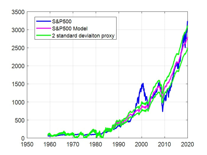 Figure 1: Actual and modeled S&P500 index. In Figure 2, it is shown how these four macro-economic variables are affecting the value of the S&P500. The variables were varied one at the time ±20% from their reference value. The reference value was assumed to be the one available on fred.stlouisfed.org at the end of November 2020. If an analyst and/or an investor are interested in understand where the market is heading in e.g. one year from now, this model can be used to create outlooks based on estimations of future values of: GDP, M1, BAA-10Y and CPI. The next question that might come to mind is whether the predictions are robust. To answer this question we need to keep two things in mind. First, the prediction is heavily dependent on the guess of the future value of the variable. If the guess is off then the prediction will be off. Second, this is a neutral model. Geopolitical events and buyers/sellers momentum are not accounted. If for any reason the GDP goes down and investors keep on heavily buying equities then the market will trend higher instead of going down as the model would have estimated. 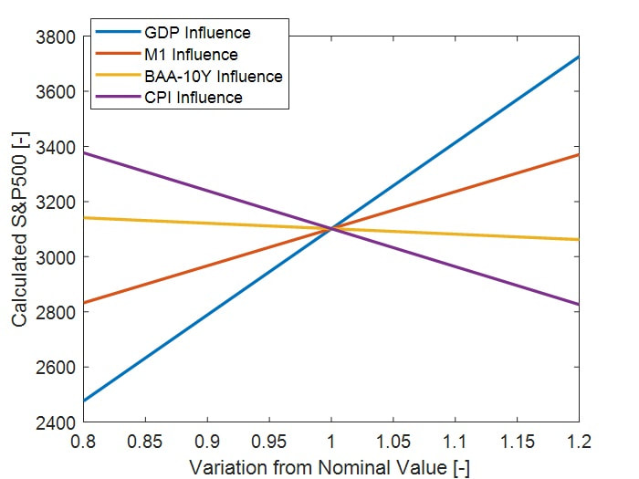 Figure 2: Calculated S&P500 as function of macro-economic variables variations from their end of November 2020 values. How to include geopolitical and market sentiment? The approach that was used in this work has been to calculate the coefficients of the model recursively. Figure 3 shows the accuracy of the model as a function of the rolling sample size. Each sample is equivalent to one month. As it can be observed, by having a smaller rolling training period the accuracy of the model improves. 733 samples (the entire time series) has an accuracy of 10.48%, with 120 samples (10 years), the accuracy is as low as 1%. This latest case is shown in Figure 4. With an improved in accuracy, such approach can be used to assess whether the market is fairly valued both based on fundamentals as well as other factors such as investor sentiment. Based on such information investors might decide whether to take a direction bet. Alternatively, as in the previous case, it can be used for short term outlooks. 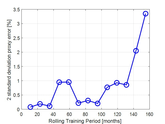 Figure 3: Model error as function of the number of samples used to train the model. 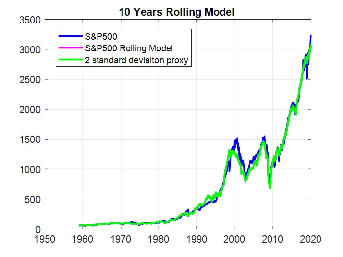 Figure 4: Actual and modeled S&P500 index. The modeled S&P500 was created using a rolling regressive approach with 120 samples (10 years).
Concluding, the two models presented in this article are able to fairly well reproduce the trend of the S&P500. The second one does a better job since it also takes into account the market dynamic on top of macro-economic factors. The models can not predict where the market is heading, the future is not written. Despite they might be able to provide insights on how far off is the fair value of the market in relation to its actual value or alternatively they might be able to indicate where the market might head based on short term estimations of the economy. The growth of your wealth is essentially made by three parts: what you earn, what you spend and potentially the returns from your investments. 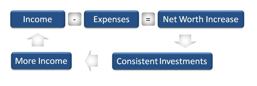 A multitude of people in my network talk about getting rich. Most of them focus on increasing their wealth by increasing the earnings. Which, it can work if expenses do not increase as fast as the salary. Many of us are working for corporations. We all know how hard it can be to get a rise in salary. We over perform our team members and then at the end of the year we hear from our manager: You did a great job but the company has not been as profitable as forecasted, this year the increase is kept at 0.75%, next year it will be better. The next year comes and here we are with a new reason not to have a rise or promotion. Can you relate to this? Probably yes and even if not, let me share with you a few things you can do to grow your wealth. Increasing your net worth by increasing your salary while working from somebody else, it is probably the hardest thing to do. Why? Because you have no control over the business you work for. So my first recommendation is to grow your wealth by acting on things you have direct control of: expenses, side hustles and investments. Let’s tackle one of them at the time. As average people spend $1,700 a month in personal consumption. Despite the fact you can afford it, have you thought of: cutting on daily coffee, prepare your own lunch, cook your meals, one night less per month eating out, less junk food, useless subscriptions,…? If you do then you can save as much as $750/month. Moving on: the side hustle. Have you thought of renting your home parking lot when you go to work? Rent the room you do not use to a student or people on vacation? Instead of watching TV, how about spending one to two hours per day providing consultancy work on websites like www.freelancer.com? Realistically, it is likely you can make an additional $500 per month. Third and last point to act on: consistently investing savings. Treasury bonds: 2.5% p.a., option trading: 10.2% p.a., passive index 9.8% p.a., managed strategy 15%p.a.,… Saving account: 0% (negative in some parts of Europe!). Recapping: thinking how to spend money and having a side hustle can give you an additional $1,250 month while investing an average of 12%. The numbers might not look exceptional and this is because people tend to focus on the present moment or days. Rarely people have a long term perspective: weeks, months, years and in some cases decades. Let’s make a little effort to look at things in the long term perspective and let’s look at two case studies: the Traditional Way and the Exponential Game. Both cases have the same starting point (salary & savings) but the first does not cut on expenses, does not invest,… while the second applies everything we have discussed so far. The result? After 10 years: the first case is worth $246,400 while the second $724,657 (+194%). After 30 years: the first case is worth $738,400 while the second $10,185,923 (+1279%). By Year 12, The Exponential Game case can be millionaire without even having a single $ rise in salary. This is not magic, it is reality! 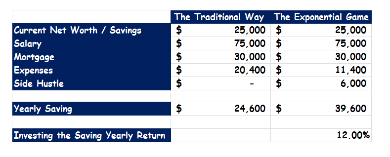 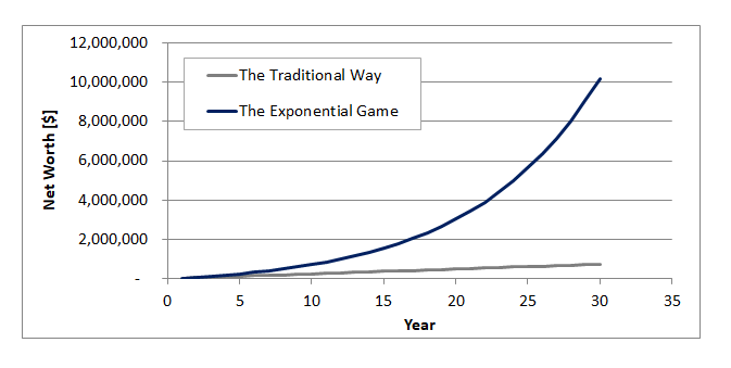 Successful investors and traders use a variety of investing techniques. Some are more profitable than others but the line in between succeeding and failing is the decision making process. All the successful traders and investors have one thing in common: they know when to enter and exit each single trade. One of the investing techniques that several people are using is price arbitrage. With this approach, the investor estimates the fair price of equities, commodities or you name it and if there is a large enough gap between the fair estimated value and the spot price then a position is entered. Position are opened either long or short depending whether the fair value is above or below the spot price. In the past I have built a couple of these models: the first to estimate the value of the S&P500 while the second the fair price of gold (here). In this article, I’ll present the work that was done in modeling the oil price of the West Texas Intermediate; WTI in short. Crude oil is a commodity and as such it follows the law of supply, demand and inventories. At constant demand, increasing the supply, the inventories go up and the price goes down. With lower supply the opposite happens. When the supply is constant and the demand decreases (what happened in early 2020 due to the COVID-19), the inventories tend to build up and the price goes down. With higher demand, the opposite happens. The WTI model that was built was based solely on the law of supply and demand. The simulated WTI price follows quite well the actual price with an accuracy of 82% and a proxy of two standard deviations of 18%. Sudden market movements due to excessive market buying or selling sentiment are not well captured; e.g. 2007-2009 and 2014-2015. 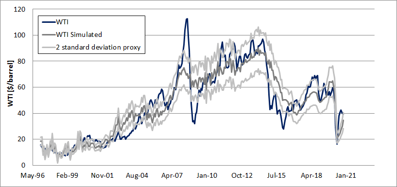 The next question that might come to mind is: how do I use it?
Let me start with how I do not use it. When I see a large enough gap between the fair and spot price, I never buy or short sell any future contract or ETPs. This is because I do not know when the two prices will converge and whether the market is gona rally in the opposite direction of the fair price. Few macro firms went bankrupt while following this approach. The way I use the model is to guide my decisions when deciding what option strategy to use. With small to non-existent price gap I tend to use neutral strategies. When the fair price is above the spot, I go with a bullish strategy while bearish in the opposite case. It goes without saying that the choice of the strategy should be made together with the current volatility rank of the WTI while properly selecting the position size and keep enough money in the account in the eventuality the option contract is assigned. If you have enjoyed the article, leave your comment below. If you find the model useful and you would like to use it, then click the link. Before you read any further, I would like you to focus on the image below and think for a minute or two if there is a pattern in what you see.  Like me, probably you have not. But… I ensure you that these lines were drawn by a mechanism that follows a given set of laws of physic: the double pendulum If you know the geometry of this pendulum and the forces acting on it then, with the right background, you will be probably able to have a given set of equations to describe its motion and its apparent randomness. In my opinion, the financial market is as random as a double pendulum. Meaning: it is not; or better not fully. I wrote a couple of articles in the past on how the value of Gold and the S&P500 can be modeled knowing the fundamental blocks of the American economy. Without sudden external forces or changes, the direction of the movement of the pendulum, market value and gold can be forecasted with a good degree of accuracy. Going back to finance. If you like investing in stocks and you are good at picking them up then probably in the very long run you will be able to generate an annualized 18% (this is what Buffet did in the last 32 years). You would have nearly over performed the S&P500 by a factor of 2! The index returned 9.8% in the same timeframe. 18% might not seem that much but investing $10,000 for 32 years the Buffett's way, you now would have nearly 2 million USD. Many of us (myself included) do not know, have no interest or have no time to go through financial statements of companies to choose which ones have high growth potential. Despite some of us are able to figure out patterns from something that in appearance looks like a chaotic system. In my opinion the most successful person at mastering this skill is the American mathematician Jim Simons. In one of his rare interviews, he claimed that he has no interest in reading financial company statements but he saw patterns in the prices of commodities. This gave him the idea to start trading and profit from the knowledge of these patterns. The result? 40% annualized return (net of fees, 66% gross) with only one single negative year. In perspective, investing the same $10,000 with Renaissance, after 32 years, the money would be worth north of 474 million USD. Comparing investing and trading:  This brings me to my last point. Truly understanding the mechanism of how stuff works can create a major competitive advantage. A mathematician (very intelligent) managed to solve the market using mathematics rather than financial statements.
If he did it, we can do it too. Key being: patience, time, knowledge and smart work. According to Benjamin Graham: “The investor’s chief problem—and even his worst enemy—is likely to be himself.” The underlying reason is that the vast majority of investors are irrational. We all have biases that can lead us to take the wrong decision. There is not much we can do about it because we are not machines but… acknowledging that there biases and understanding them, next time we face one, we might be able to spot it, do something about it and probably take a better decision. In the investment process, investors often experience the “roller coaster of emotions”. Does this look or feel familiar? 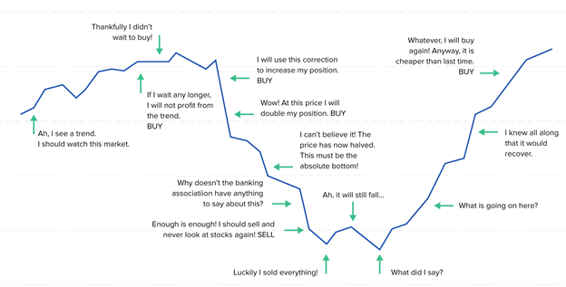 If so, you’re not alone. After all, the cyclical investment process is full of psychological pitfalls. However, only by becoming aware of and actively avoiding behavioral biases can lead investors to take better and hopefully impartial decisions. Bias does not always have a negative connotation. They can help us in our day to day lives but when it comes to investing, they might have the opposite effect. There are two categories of bias: cognitive and emotional. In the first case we might misinterpret information and data and/or wrong memories. In the second case, people act based on feeling and emotions instead of facts. When it comes to investor’s biases, we can identify four of them. Overconfidence Investor overconfidence can lead to excessive or active trading, which can cause underperformance. In a 1999 study, the least active traders had annual portfolio return of 18.5%, versus the 11.4% return that the most active traders experienced. 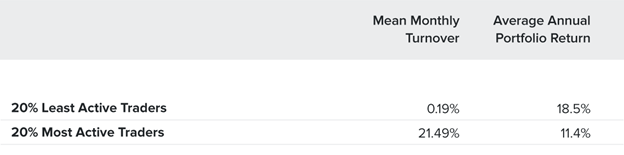 Loss Aversion Fear of loss. When asked to choose between receiving $900 or taking a 90% chance of winning $1000, most people avoid the risk and take the $900. This is despite the fact that the expected outcome is the same in both cases. However, if choosing between losing $900 and take a 90% chance of losing $1000, most people would prefer the second option (with the 90% chance of losing $1000). The "disposition effect" is the tendency of investors to sell winning positions and hold onto losing positions. This effect directly contradicts the famous investing rule, “Cut your losses short and let your winners run.” 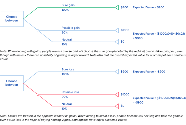 Portfolio Construction and Diversification Familiarity Bias. Investors prefer to invest in "familiar" investments of their own country, region, state, or company. Misuse of Information Gambler’s Fallacy. When asked to choose which is more likely to occur when a coin is tossed—HHHTTT or HTHTTH—most people erroneously believe that the second sequence is more likely. The human mind seeks patterns and is quick to perceive causality in events. Attention Bias. A 2006 study posits that individual investors are more likely to buy rather than sell those stocks that catch their attention. For example, when Maria Bartiromo mentions a stock during the Midday Call on CNBC, volume in the stock increases nearly fivefold minutes after the mention. 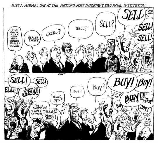 Investing money is a strategic process. Learn your blind spots, develop a systematic strategy and be part of that 20-30% that can make money in the financial market. Source: this article was a re-edit of Why Investors Are Irrational, According to Behavioral Finance from Melissa Lin
https://www.toptal.com/finance/financial-analysts/investor-psychology-behavioral-biases I was born in the 1980’s in a coastal town in the south of Italy and life was great in that decade. Great, mostly for the Baby Boomers and the Silent Generation. If your parents were high school teachers in their forties, they could afford a house or two paid cash. A family of medical doctors could afford a new FIAT every month and still put food on the table. If you were 60 years old, you could retire with a lavish pension enjoying: the beach, the sun, the wine and the food. So basically my generation, the Millennial, grew up with that stereotype of life in mind. Graduate, get a decent job, make a family and enjoy life. Thirty years later and it is hard to debate that the Western World is a totally different place nowadays.
I am a hard coded engineer and by nature, we (engineers) think of the worst while hope of the best. During the 2008 financial crisis, I had few recurring scary thoughts. Jobs opportunities are limited and do not pay much, how am I gona afford the same lifestyle as my parents did? People live longer, there are less newborns, governments are on the hedge of bankruptcy, who will pay my pension? It was and it is, still today, an uncertain time for generations like the Millenials and Gen Z. Being sad and nagging definitely it is not gona help. Like Caecus used to say: Homo faber suae quisque fortunae ("Every man is the artifex of his destiny"). If we really want, we can take control of our future and mold it the way we want it to be. Actions must be taken because life is not like the book of Rhonda Byrne (“The Secret”, the law of attraction stuff). Actions, what can we do? Back again in 2008, I remember I received a notification from my bank stating to cash in some money that was left in some kind of financial instrument by my mom 20 years earlier. I was happy and at the same time surprise. Why surprised? The sum received was 10 to 15 times what was invested 20 years earlier. I did not give much importance and thoughts to this until five years ago when I became passionate by finance. Compounding: how beautiful this concept is. 10 to 15 times the return of investment in 20 years is equivalent to annualized gains of 12 to 15%. Essentially, not too far from what it can be made by investing in a passive index fund tracking the S&P500 (9.8% in the last 90 years or a total return of 451,000%). I wish I would have learned this basic skill in my younger age together with everything else I have learned at school. Why? Let’s assumed that my parents were so generous to donate me $1,000 at my birth and invest them in the S&P500. By the age of 15, my account would have been worth $4,065. With a great school system, teaching students about passive investments and compounding (i.e. the Financial Literacy class that, in my opinion, everybody should be thought), I would have decided to take $20 per month from my allowance or afterschool job, and put it in the saving account that my parents created 15 years earlier. By the age of 25, my account would be worth $14,513. I am 25 with a decent job and now I can save $100 per month. Guess what, at the age of 33, the account would have been worth $49,180. I get a better job with higher salary and cutting few expenses (weekends, eating out,…), I can save $300/month until the age of 65. By that time, my account would be worth $1,583,586. Impressive, is not it? Compounding, patience (lot of it), investing in a passive index, saving money here and there, can do the trick. Think of Warren Buffet. At 14, he had $5,000 and at 83, he had $83.58 billion. If you do the math, this is equivalent to an annualized return of 26.6%. It is impressive and well above the S&P500 but not impossible to realized similar annualized returns. What if we start later in life? Compounding can still do the trick. Of course this is not enough because we need to invest in something better than a passive index like the S&P500. Smartly rotating uncorrelated assets (equities, bonds and gold) can do the trick. An annualized 20% is within reach without taking excessive risks. The result? Investing $25,000 at the age of 35 and adding $300 per month then by the age of 65, the account should be worth $10,185,581. Not too bad, is not it? Bottom line: it does not matter when you were born or how uncertain the future might look like, financial literacy can help you in making each sweat earned $ to work for you, helping building a solid future. Patience is the key. The short answer is: nobody knows not even artificial intelligence. Lot of people have tried to predict the future and it does not take a lot before you stumble on somebody on YouTube or Google that ensures you to double your money each year because they know what the market will do the next day. Thinking a bit in perspective, let’s say that some money manager would have found this holy grail, it would not take more than 10 years for a fund to go from 100M$ to 102T$. Wait a bit longer and the fund will take over all the money in the market. Unlikely, right? Nowadays, Artificial Intelligence is a quite popular field that is gaining traction in everything that surrounds us. Why then not to use AI to make predictions on how the market will move the next day? Let’s try and see what we get. To do the job, I believe that the most suited AI architecture is the long short-term memory (LSTM). LSTM networks are well-suited to classifying, processing and making predictions based on time series data. It has the ability to encapsulate the notion of forgetting part of its previously stored knowledge, as well as to add part of the new information. Personally I found that the highest level of accuracy is achieved when LSTM algorithm remembers only what happened in the previous 5 days. LSTM was applied to predict the next day price of the XIV (short selling VXX). To be honest when the simulation was completed, I thought I discovered the holy grail of investing. Simply look at the image below, the two curves are matching. 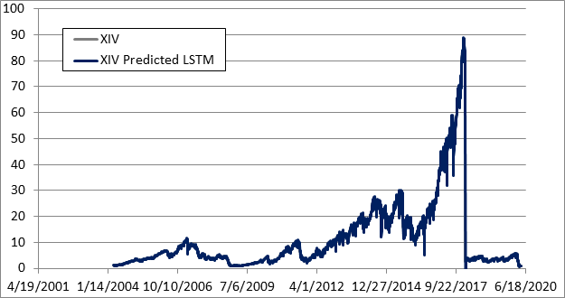 My enthusiasm was short lived because looking closely at the two lines, there was a gap. The gap might not seem much but if we are thinking whether to short the VXX or being in cash based on this predicted value then this difference will play a major role. 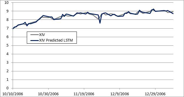 I then ran a backtest in which the strategy was in cash if the expected next day return was negative and short VXX if positive. What happened? It did not go well: poor performances and lot of drawdown. This means that the gap in value between the estimation and the actual value even if in appearance it looks small then it is not as negligible as one might think. 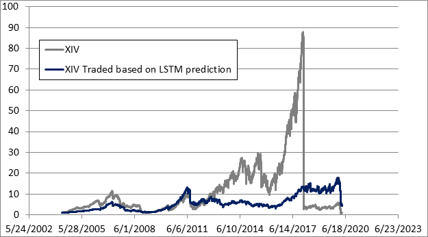 There are some techniques that can improve the results. I’ll illustrate them in the next post but in either cases…
The bottom line is: tomorrow can not be predicted with high enough accuracy, neither by humans nor by machines. Which in perspective is quite nice because otherwise life would be totally boring and dull. |
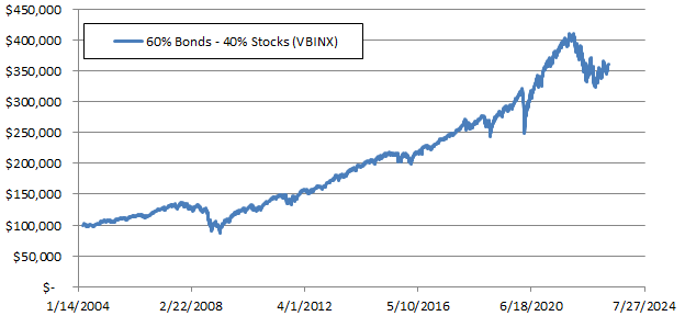
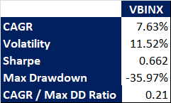
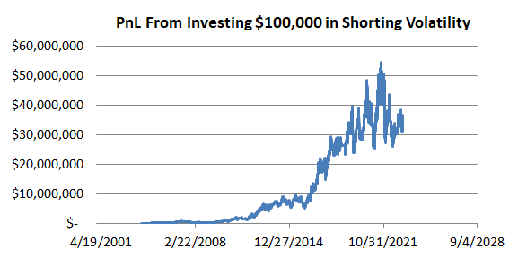
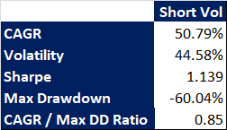
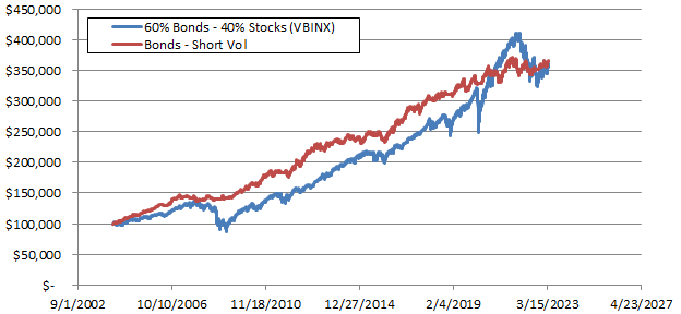
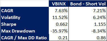
|
|
Questions?Contact us here.
DisclaimerThe information, analysis, data and articles provided in this and through this website are for informational purpose only. Nothing should be considered as an investment advice. Alpha Growth Capital does not make any recommendation to buy, sell or hold any security or position. The website and information provided through it are marketed “as is”. There is no guarantee that anything presented and provided on this and through this website is complete, accurate and correct. Relying on the information provided on this website and through its communication channels is done entirely at the individual own risk. There is no registration as investment advisor under any security law and nothing provided in this and through this website should be interpreted as a solicitation to buy, hold or sell any mentioned financial product or service. Past performance is not indicative of future results. Any financial decision is at the sole responsibility of the individual.
By navigating in this website, you agree to its Terms & Conditions |